Rainboba Tea is a Pacific Northwest-based beverage brand focused on creating high-quality, ready to drink boba teas inspired by nature and community. The brand emphasizes sustainability, donating 20% of its proceeds to environmental restoration efforts.
Rainboba Tea needed a brand identity that could stand out on crowded shelves while still feeling natural and eco-friendly. To solve this, I created a cohesive identity with a vibrant, nature-inspired look, along with three unique flavor logos, can designs, and matching magazine ads to highlight each flavor and strengthen the brand’s presence.
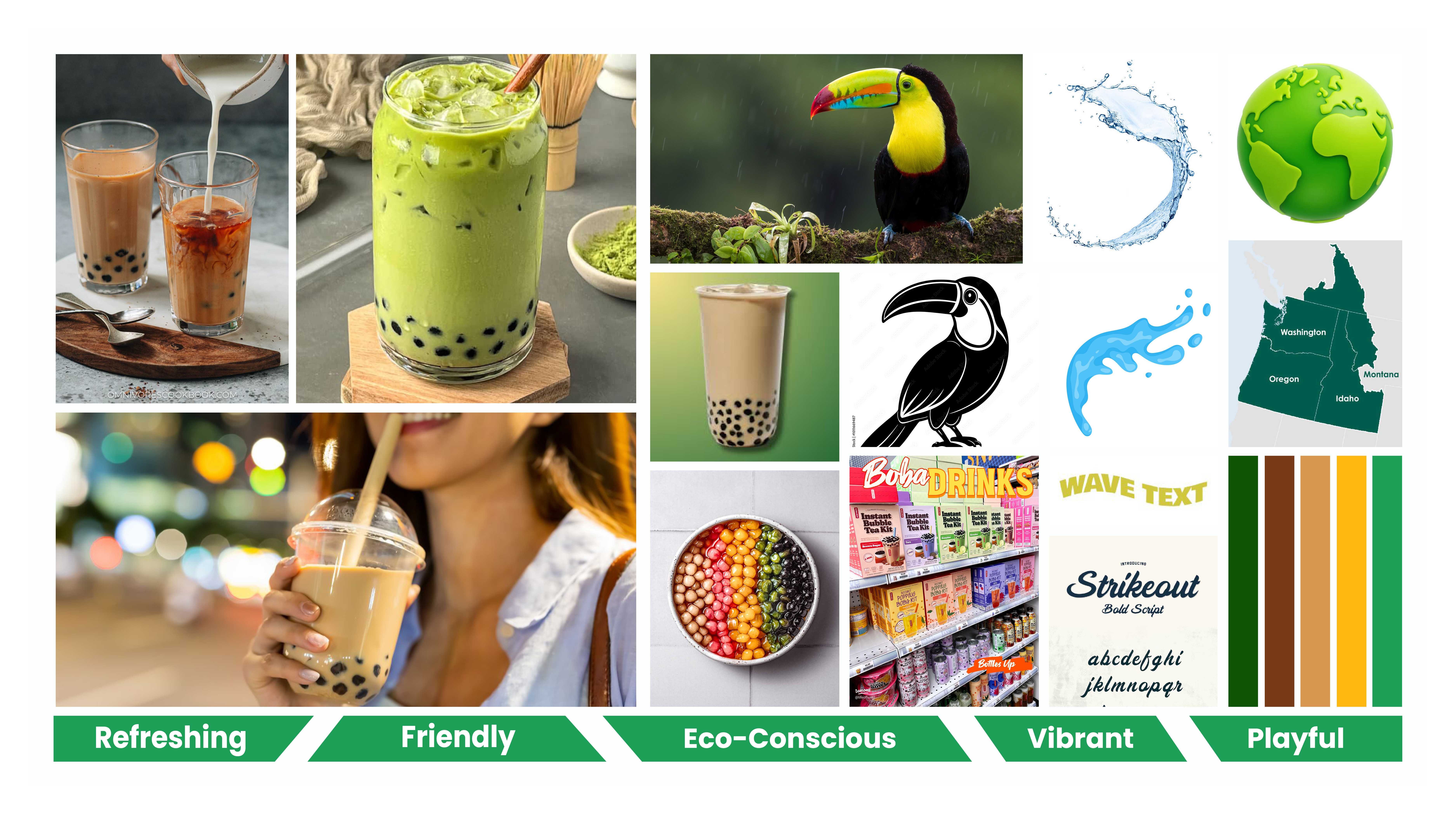
This mood board combines tropical imagery, vibrant greens, and fluid shapes to establish a fresh, playful, and nature-inspired brand direction. It also highlights the brand’s focus on sustainability and community, reinforcing a connection between natural ingredients and an uplifting, approachable experience.

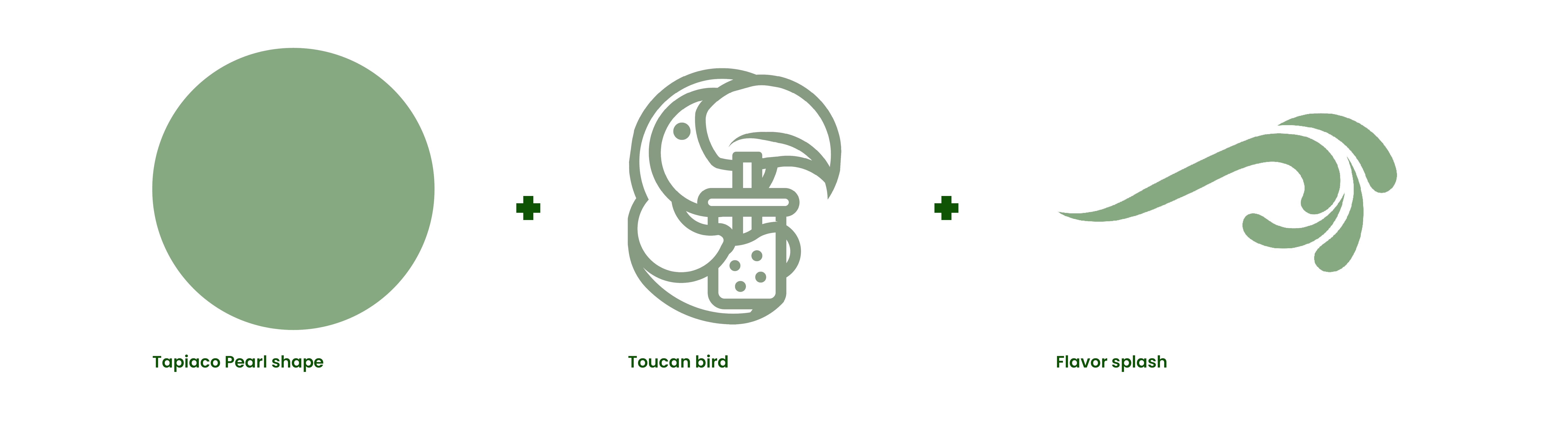
Initial sketches explored logo concepts, icon directions, and packaging layouts. This phase helped establish the visual personality of the brand and guided the development of a strong, recognizable identity system.The toucan bird concept was selected to represent Rainboba’s natural and vibrant brand identity.
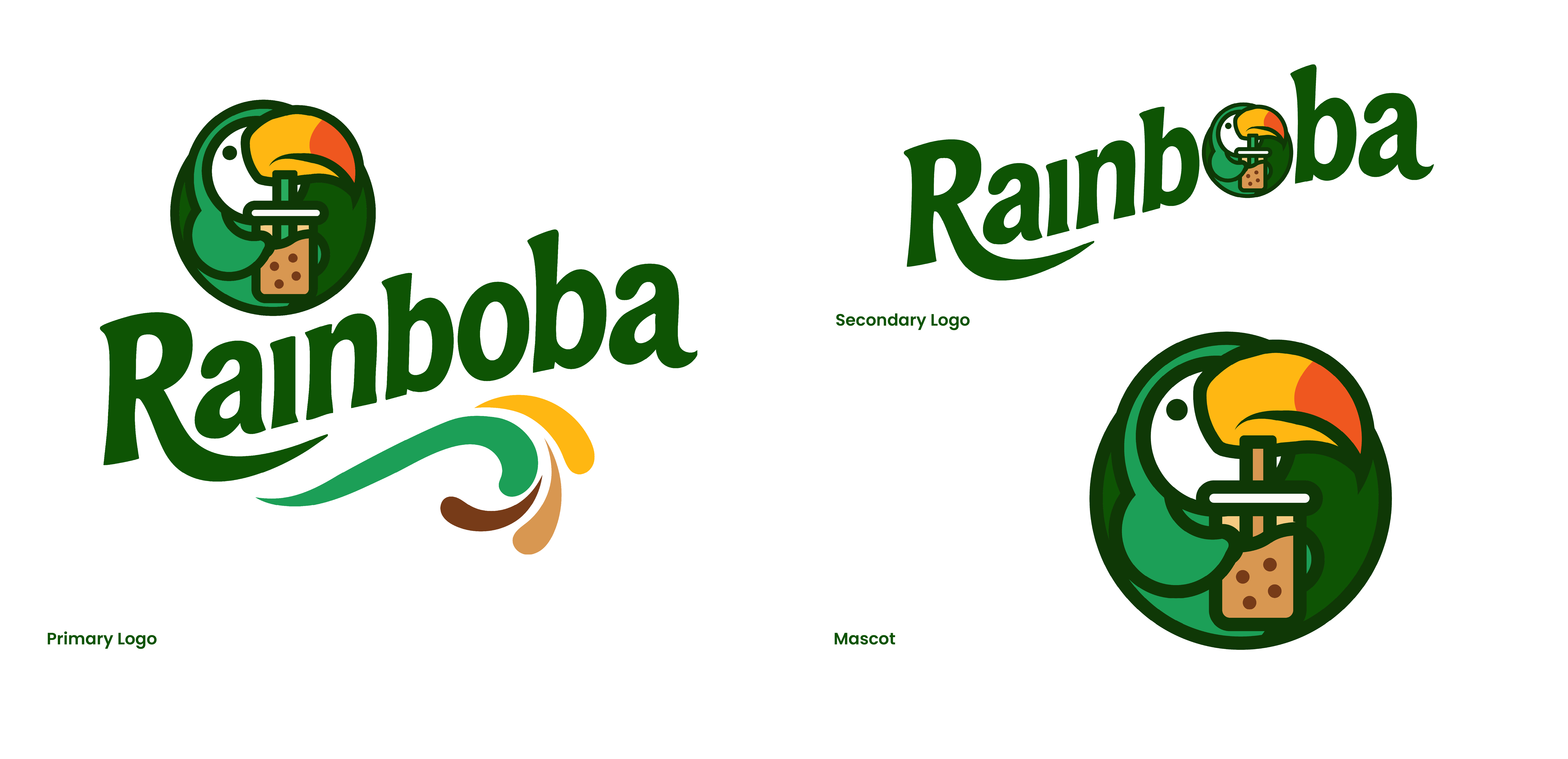
The bold, fluid wordmark reflects movement and freshness, inspired by the natural flow of tea. The circular icon combines a stylized boba drink with a toucan, reinforcing Rainboba’s natural and tropical identity while adding a playful and vibrant focal point. The green color palette emphasizes sustainability and freshness, aligning with the brand’s eco-conscious values. The clean, rounded shapes enhance approachability and make the design feel friendly and inviting. Overall, the logo creates a strong, memorable identity that balances natural elements with a modern, energetic aesthetic.
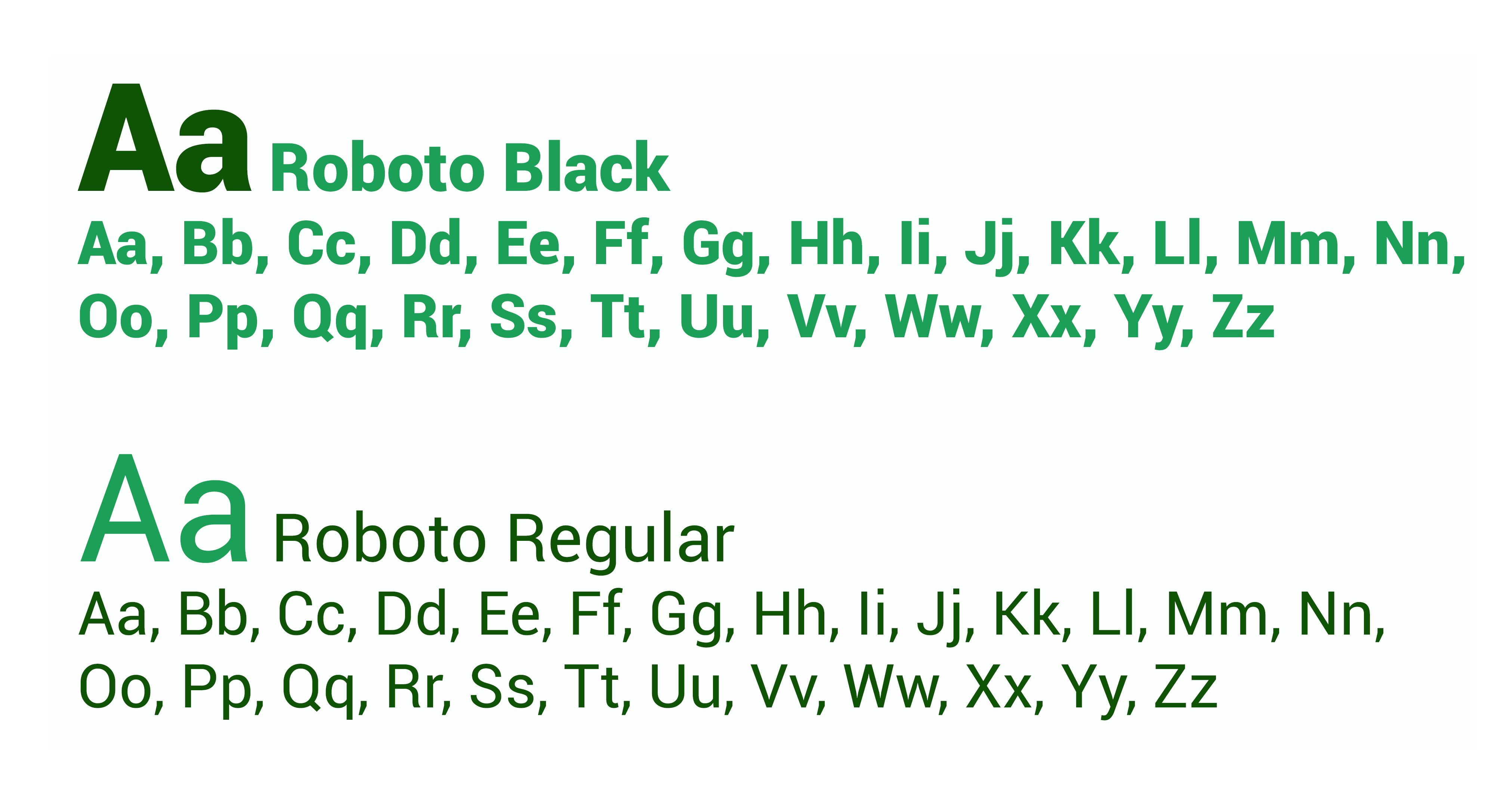
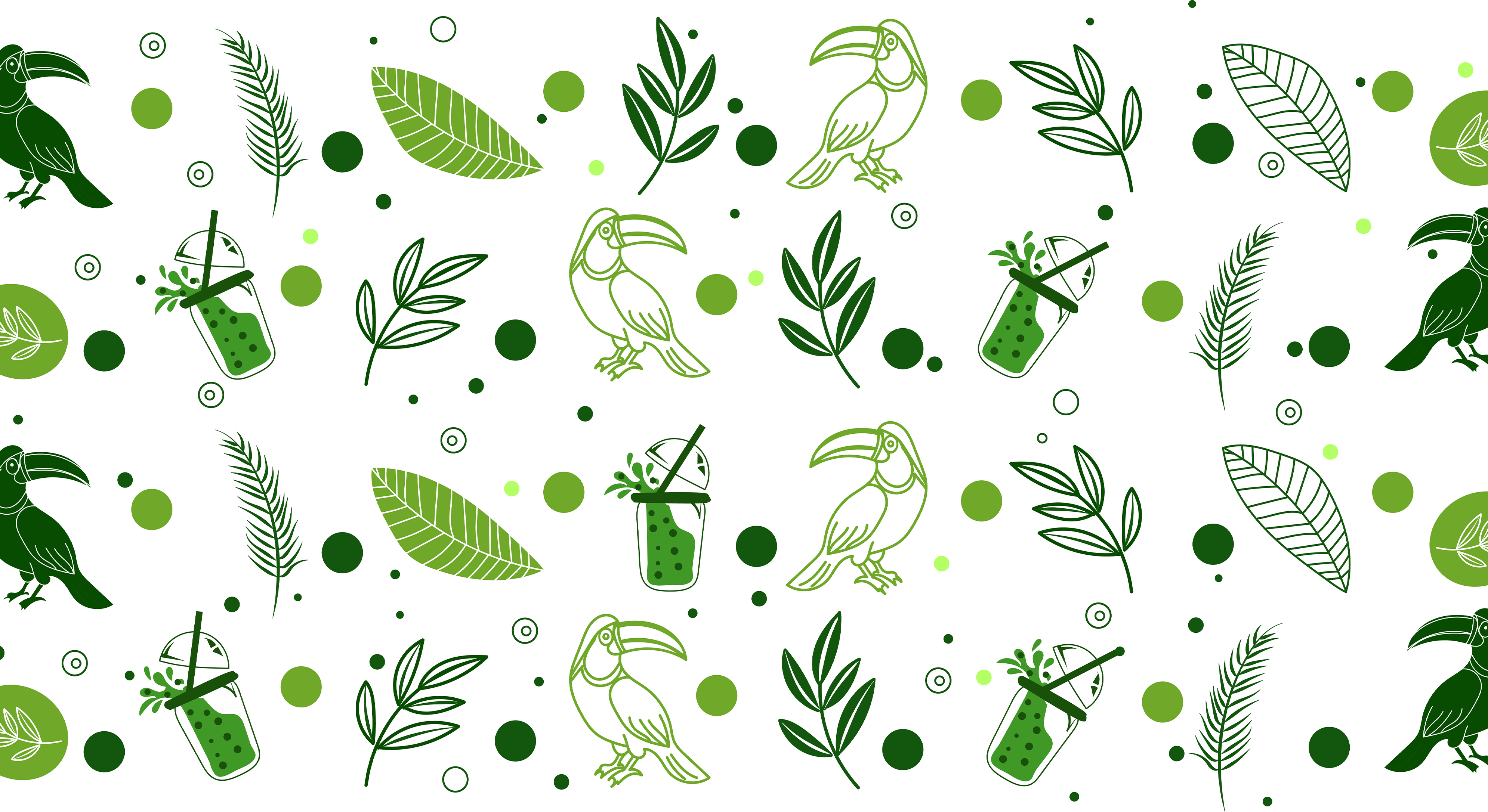

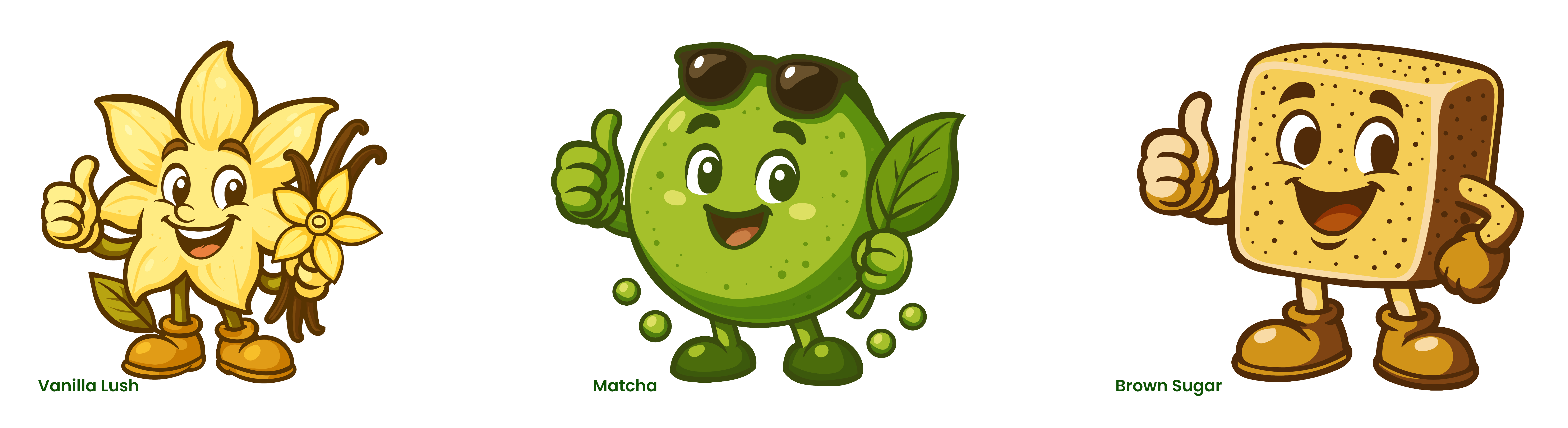
The Rainboba brand is supported by a cohesive visual system that combines clean typography, a vibrant color palette, and expressive illustrations. The use of green tones and organic shapes reinforces the brand’s focus on freshness and sustainability, while playful character designs add personality and flavor distinction. These elements work together to create a flexible and consistent identity across packaging, digital platforms, and marketing materials.
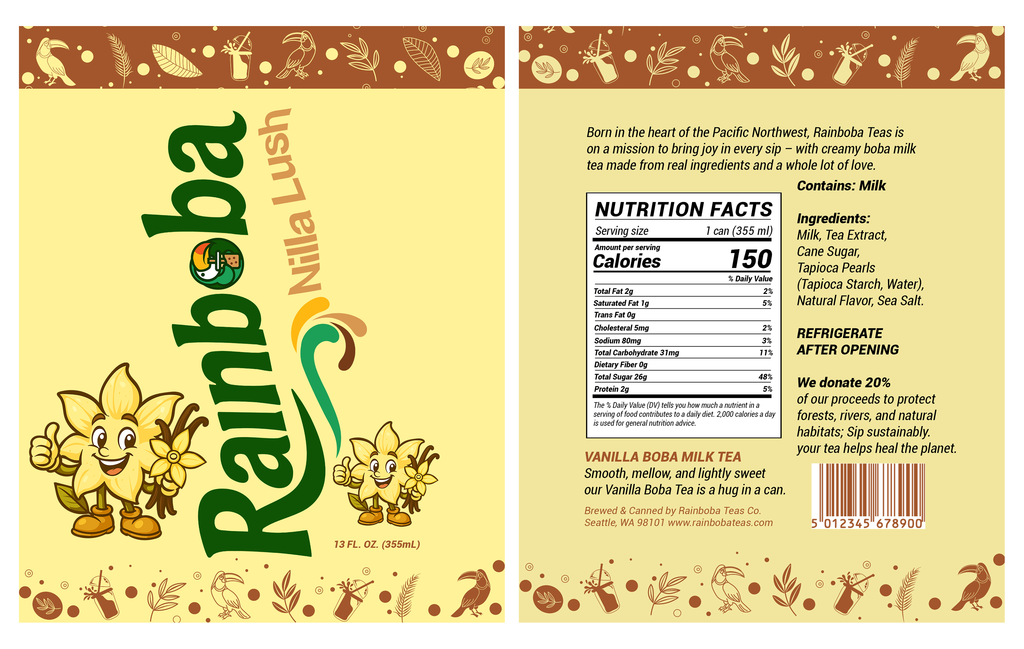
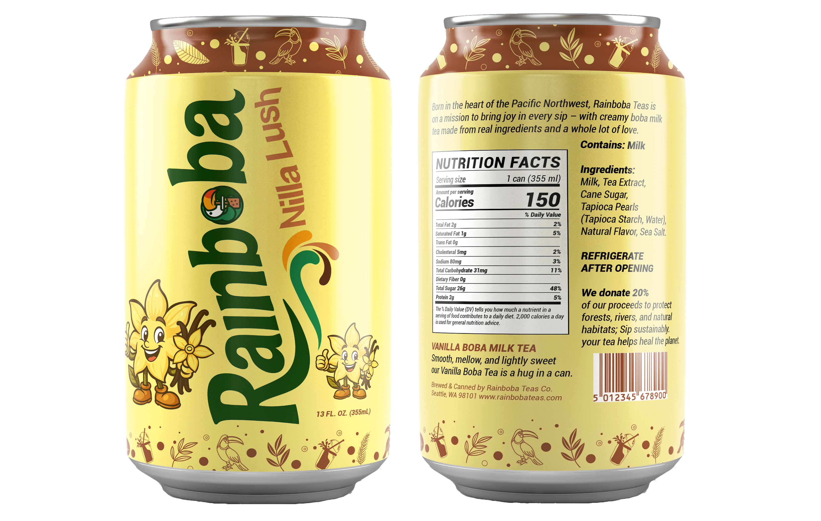
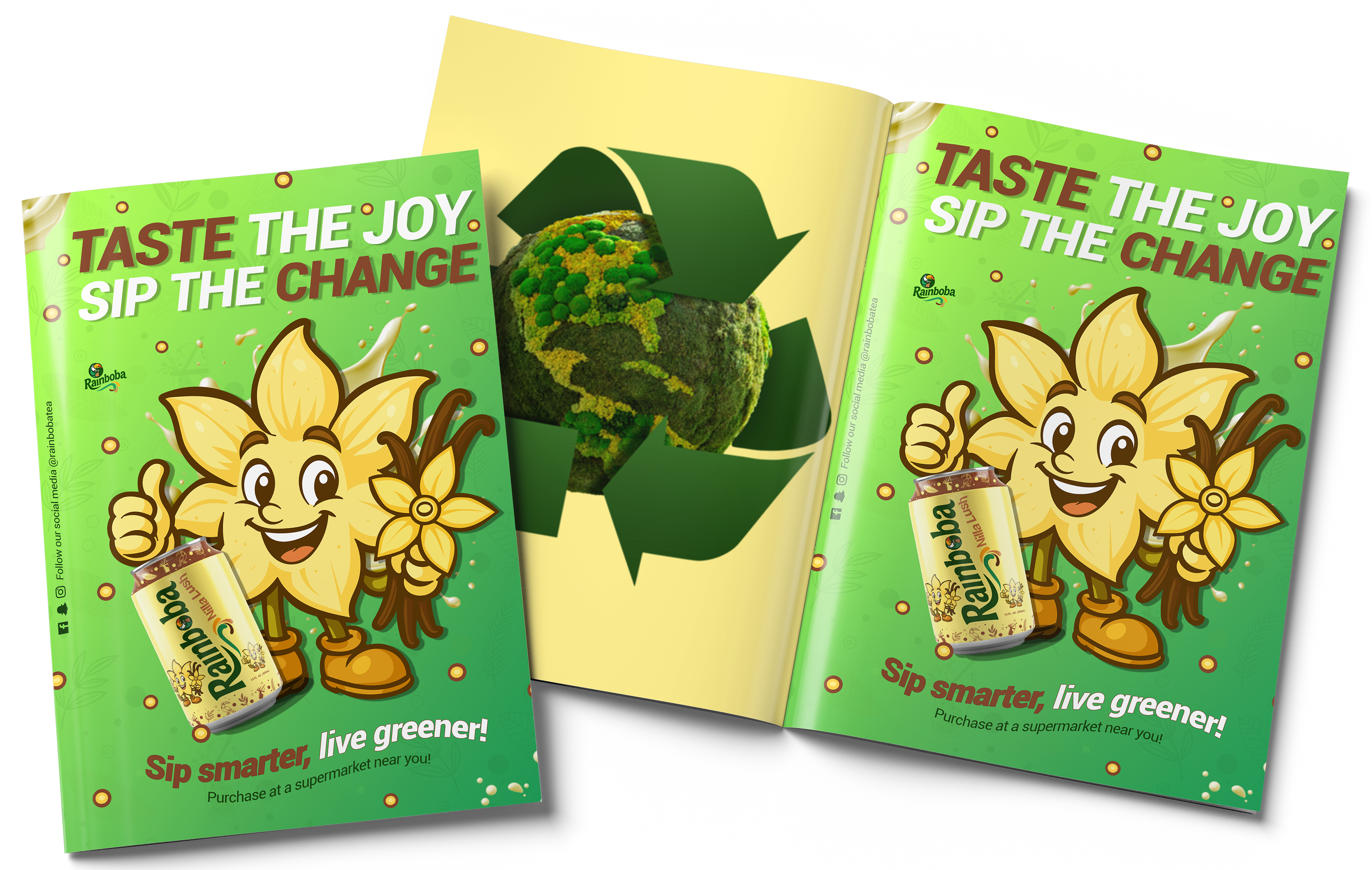
Represented through soft, warm tones and creamy visuals that reflect its smooth, comforting taste. The flower mascot was designed to embody the natural and gentle essence of vanilla, using friendly expressions and organic shapes to create a welcoming and approachable feel. The magazine ad reinforces this identity through bright, engaging visuals and a clear call to action, combining playful illustration with product imagery to highlight both flavor and values.
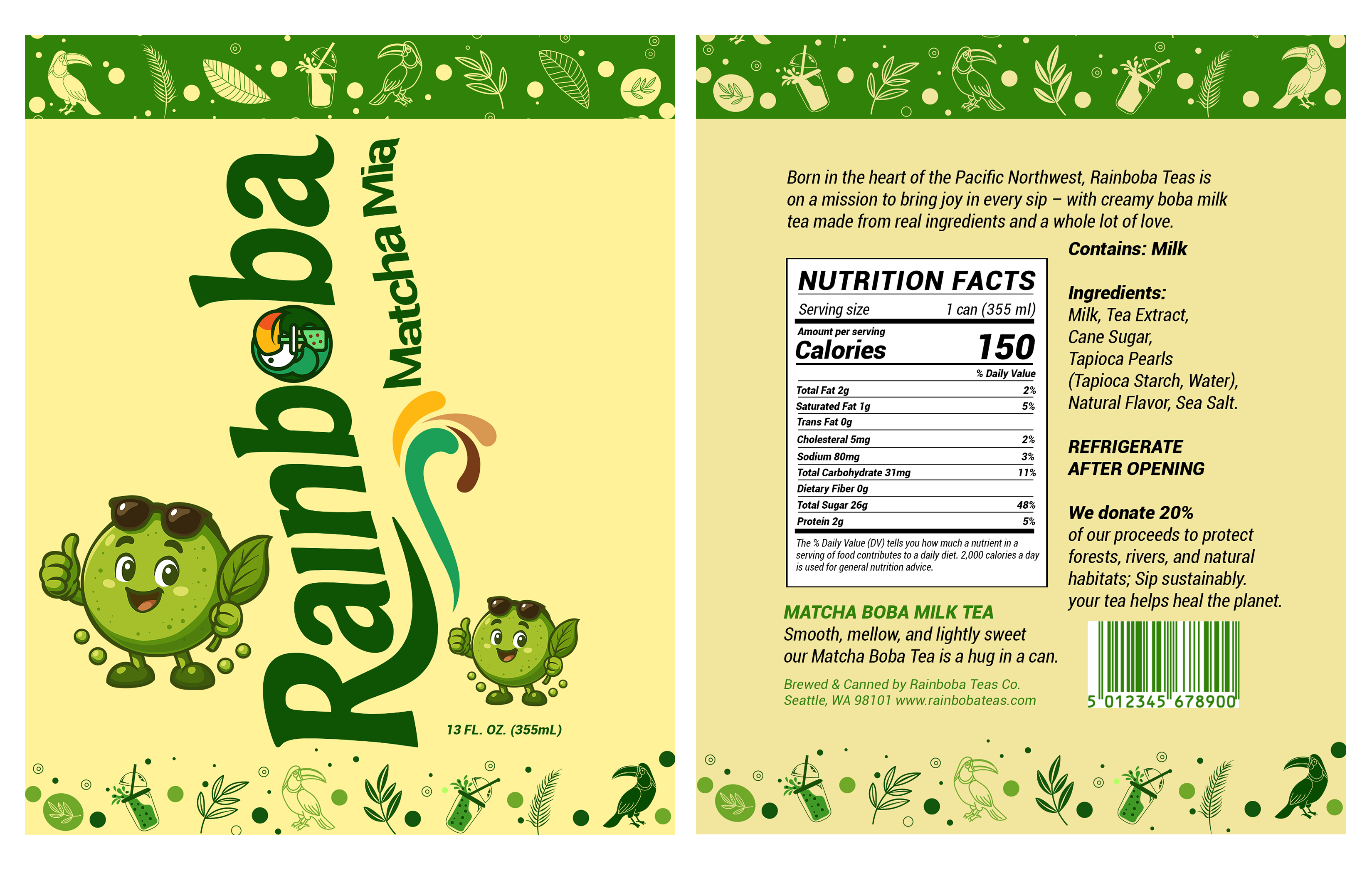
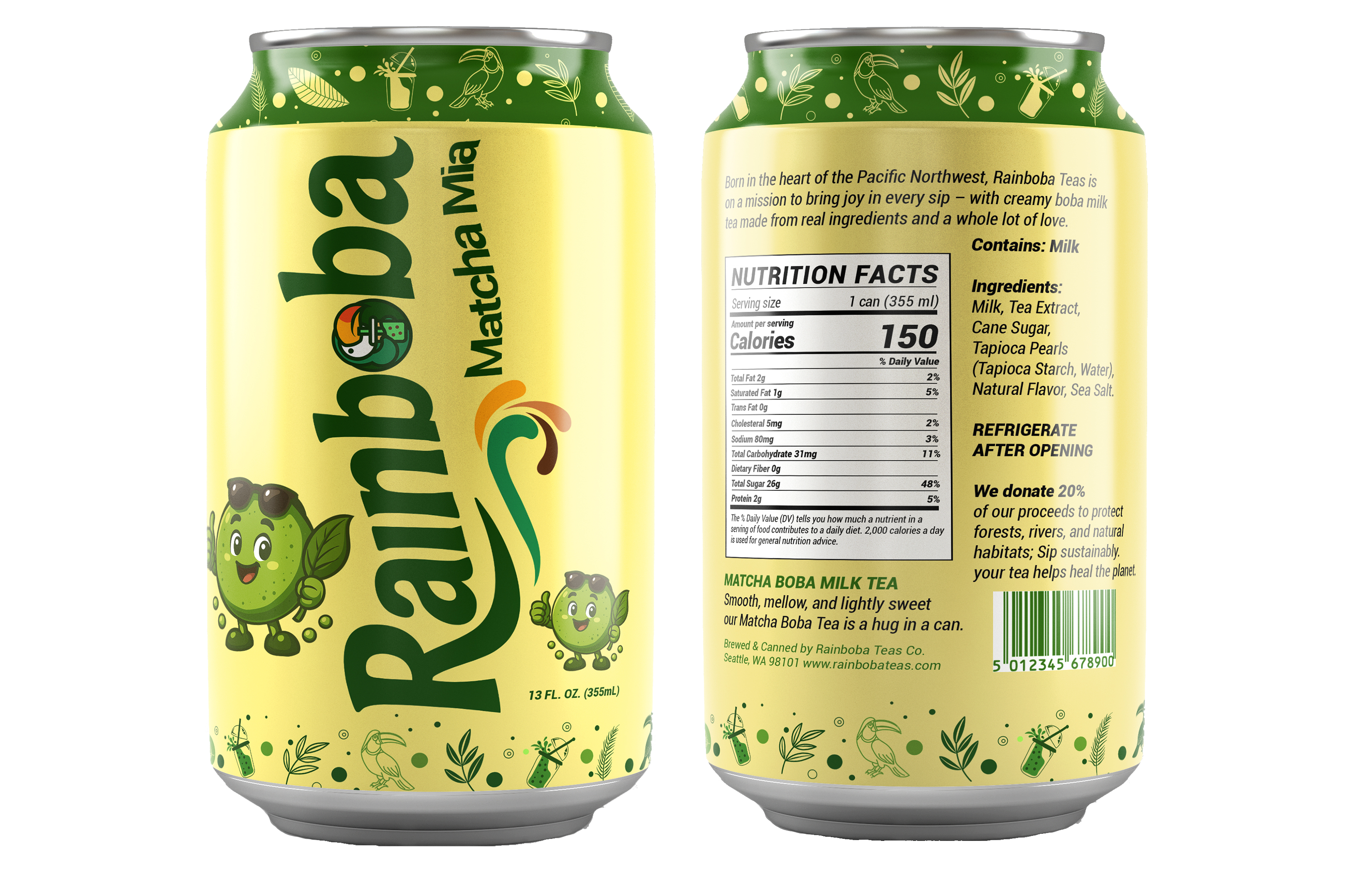
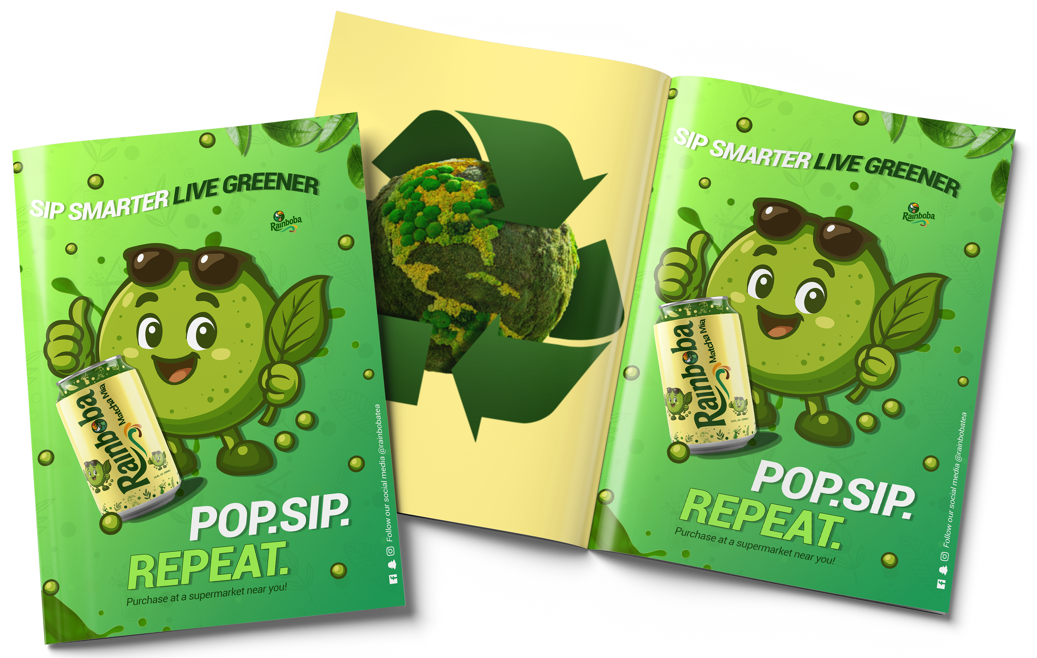
Represented through vibrant green tones and fresh, earthy visuals that reflect its natural and energizing taste. The mascot was designed to embody the lively and refreshing qualities of matcha, using playful expressions and organic elements to create a fun and approachable character. The magazine ad reinforces this identity through bold visuals and a clear call to action, combining playful illustration with product imagery to highlight flavor and eco-conscious values.
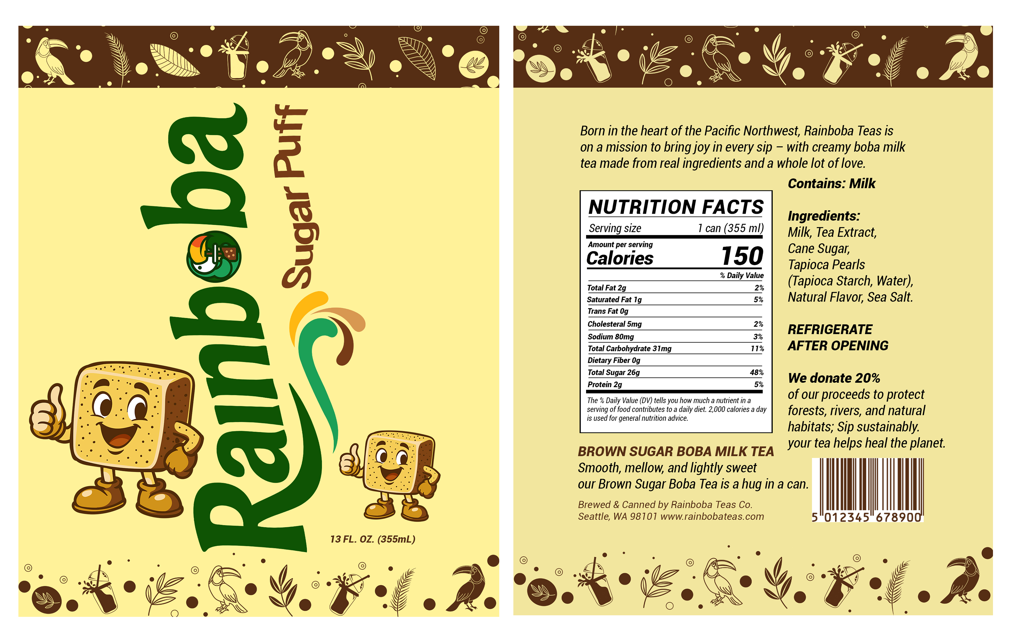
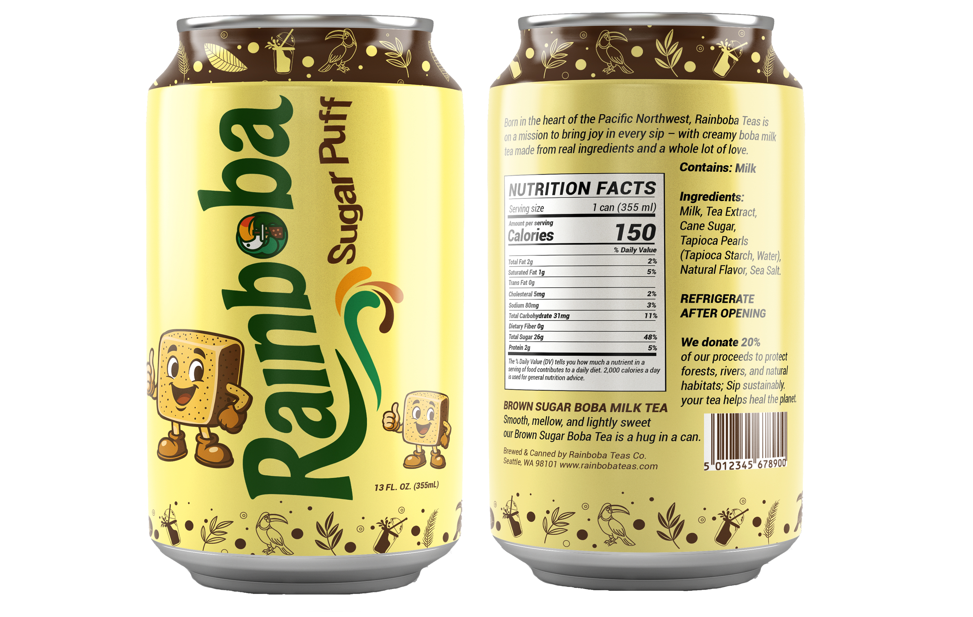
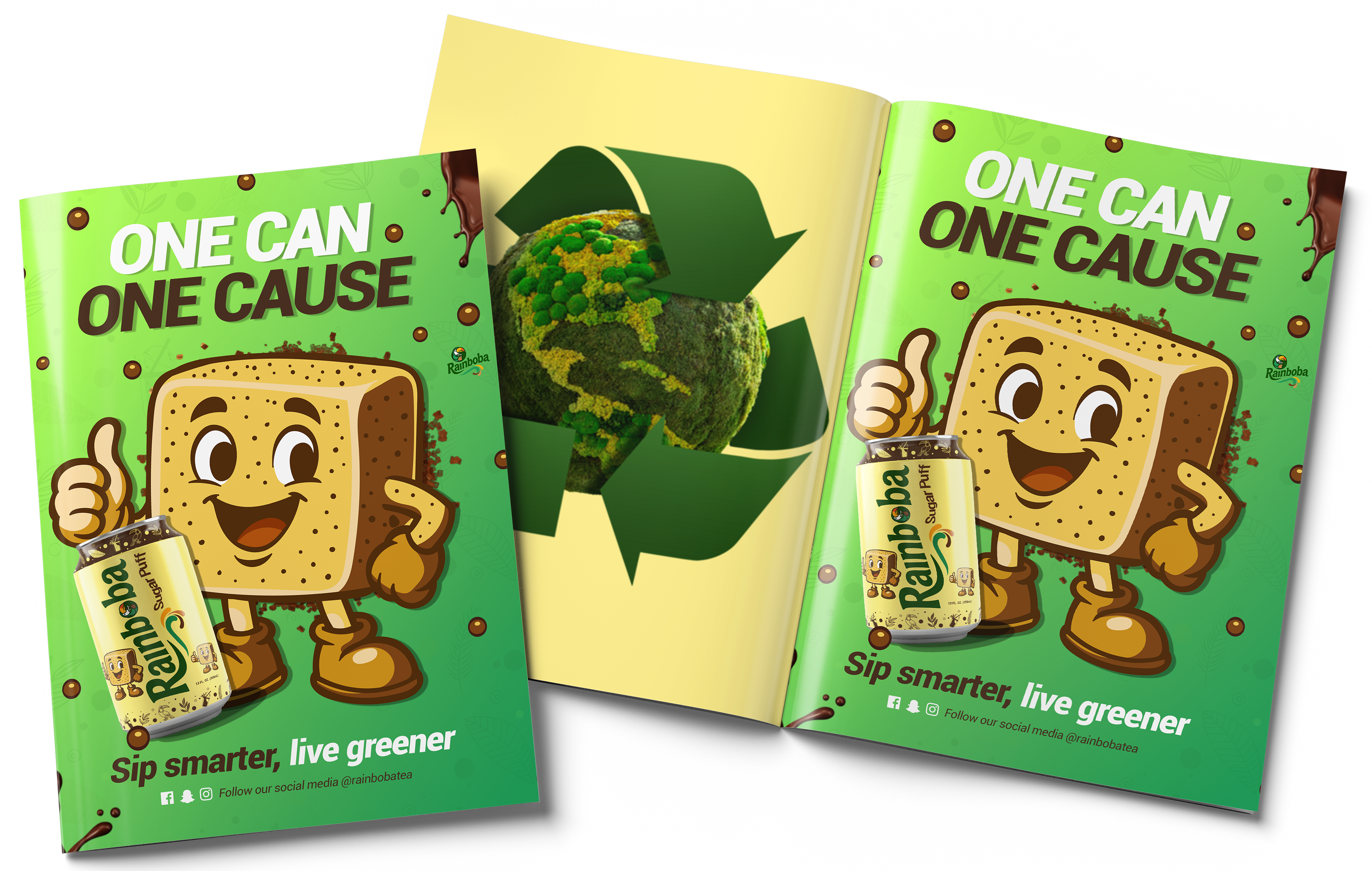
Represented through warm, rich tones and sweet, earthy visuals that reflect its smooth and indulgent taste. The mascot was designed to embody the comforting and playful qualities of brown sugar, using friendly expressions and soft, rounded shapes to create an approachable character. The magazine ad reinforces this identity with bold visuals and a clear call to action, highlighting flavor and eco-conscious values.