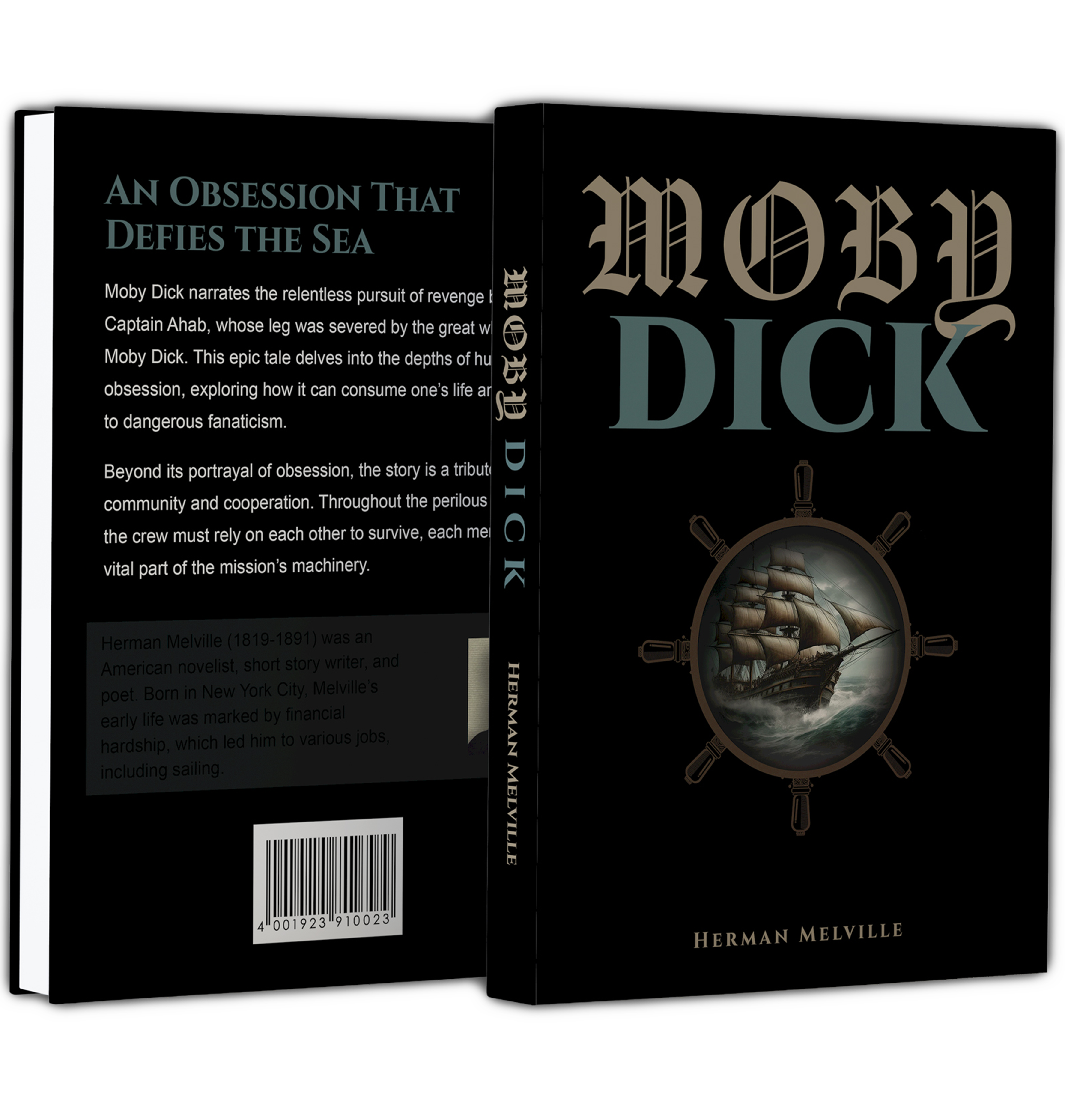
This project reimagines the cover design for Moby Dick through a dark, atmospheric visual approach that reflects the novel’s themes of obsession, danger, and the unknown. The design uses typography, imagery, and composition to create a dramatic editorial presentation.
The goal of this project was to redesign a classic book cover in a way that feels visually compelling while remaining true to the novel’s tone and subject matter. A key challenge of the assignment was to convey the story of Moby Dick without relying on any direct imagery of the whale, encouraging a more conceptual and symbolic approach. I focused on creating a strong visual hierarchy, dramatic contrast, and a clear editorial structure to produce a design that feels both modern and appropriate to the narrative.
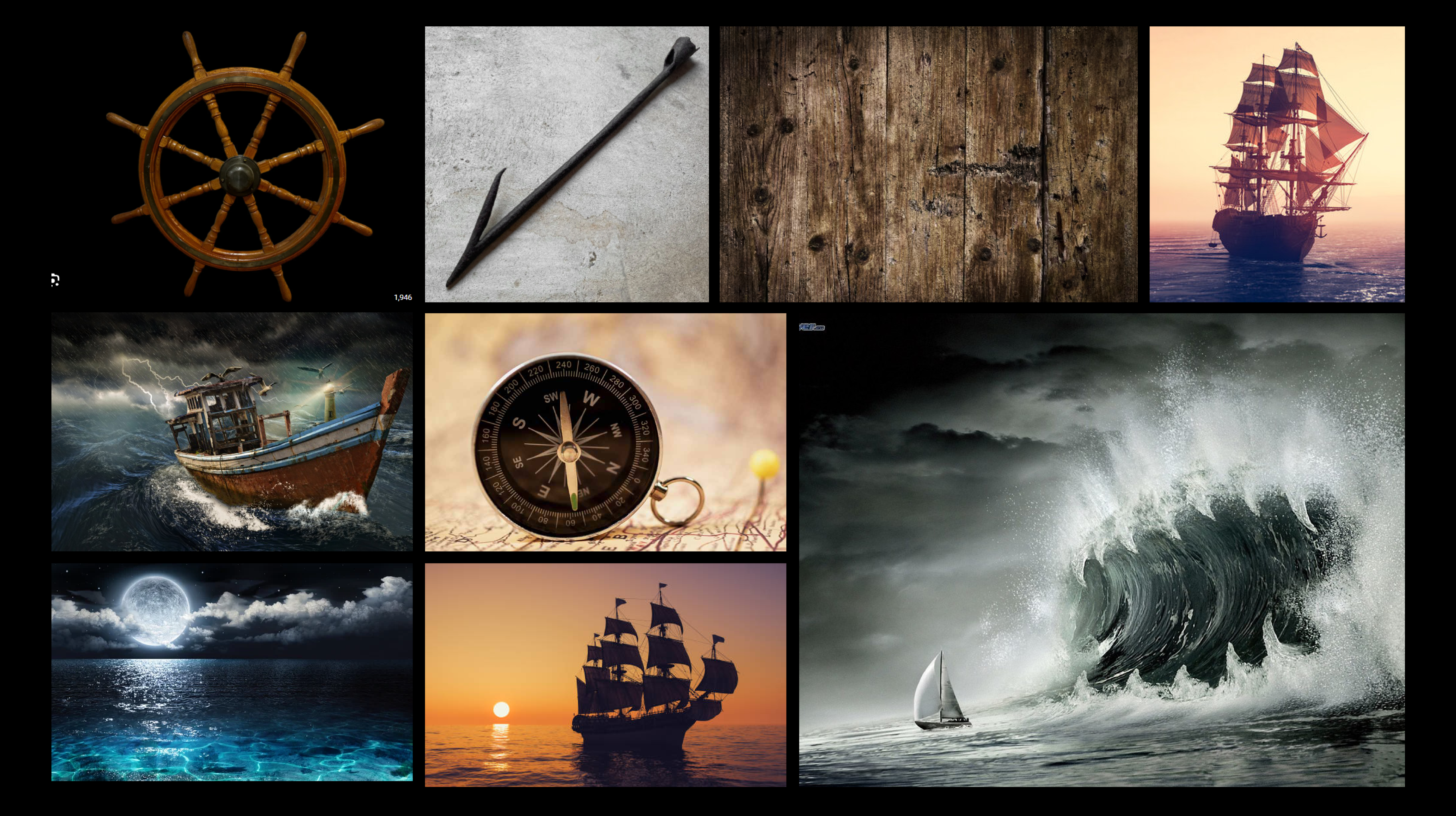
This moodboard explores nautical elements and the harsh, unpredictable nature of the sea to capture the tone of Moby Dick. It combines imagery of ship wheels, harpoons, compasses, and wooden textures with dramatic ocean scenes and sailing ships to reflect themes of navigation, danger, and obsession. The mix of dark waters, stormy waves, and warm sunset tones helps establish a balance between tension and calm, guiding the visual direction toward a symbolic and atmospheric design rather than a literal depiction of the whale.
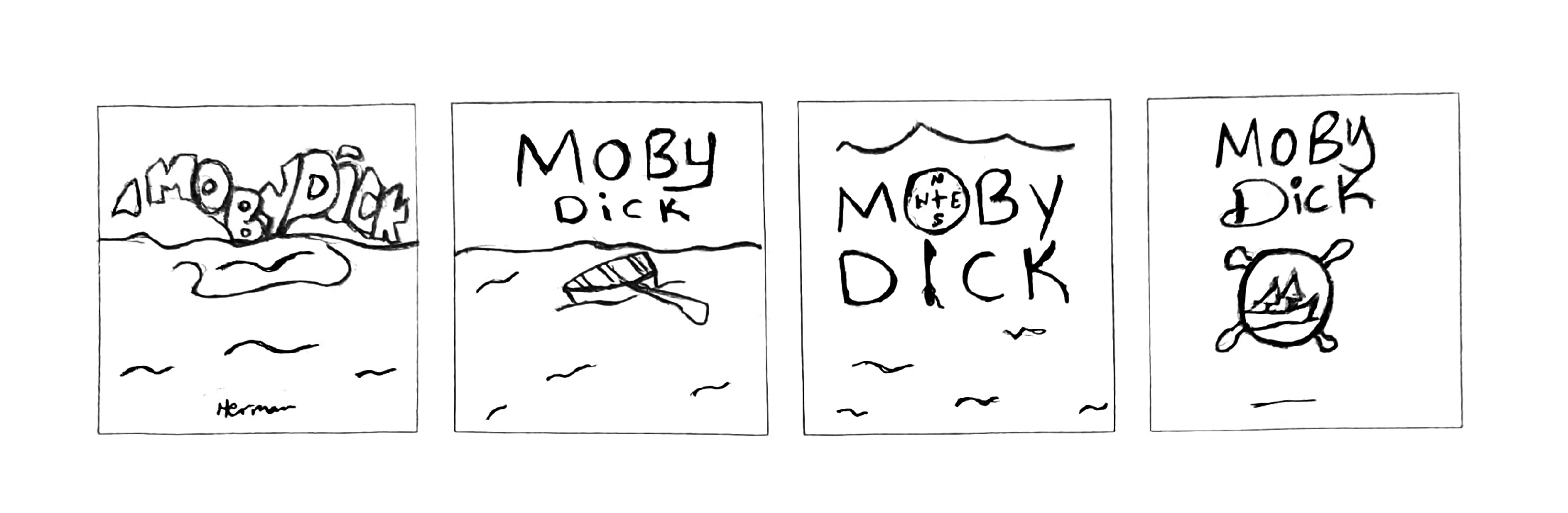

This concept evolved from early thumbnail sketches exploring different ways to represent Moby Dick through simple, symbolic imagery. The final direction combines a ship’s wheel, ocean waves, and a sailing ship to visually communicate themes of navigation, isolation, and the unpredictability of the sea. Rather than directly depicting the whale, the design uses these elements to represent the journey and obsession at the core of the story, reinforced by strong, classic typography.
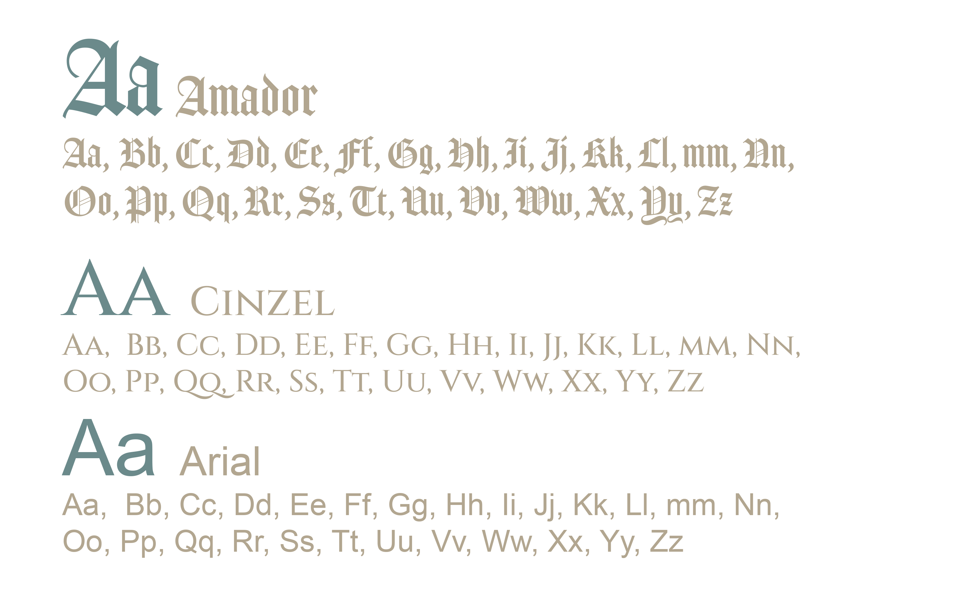
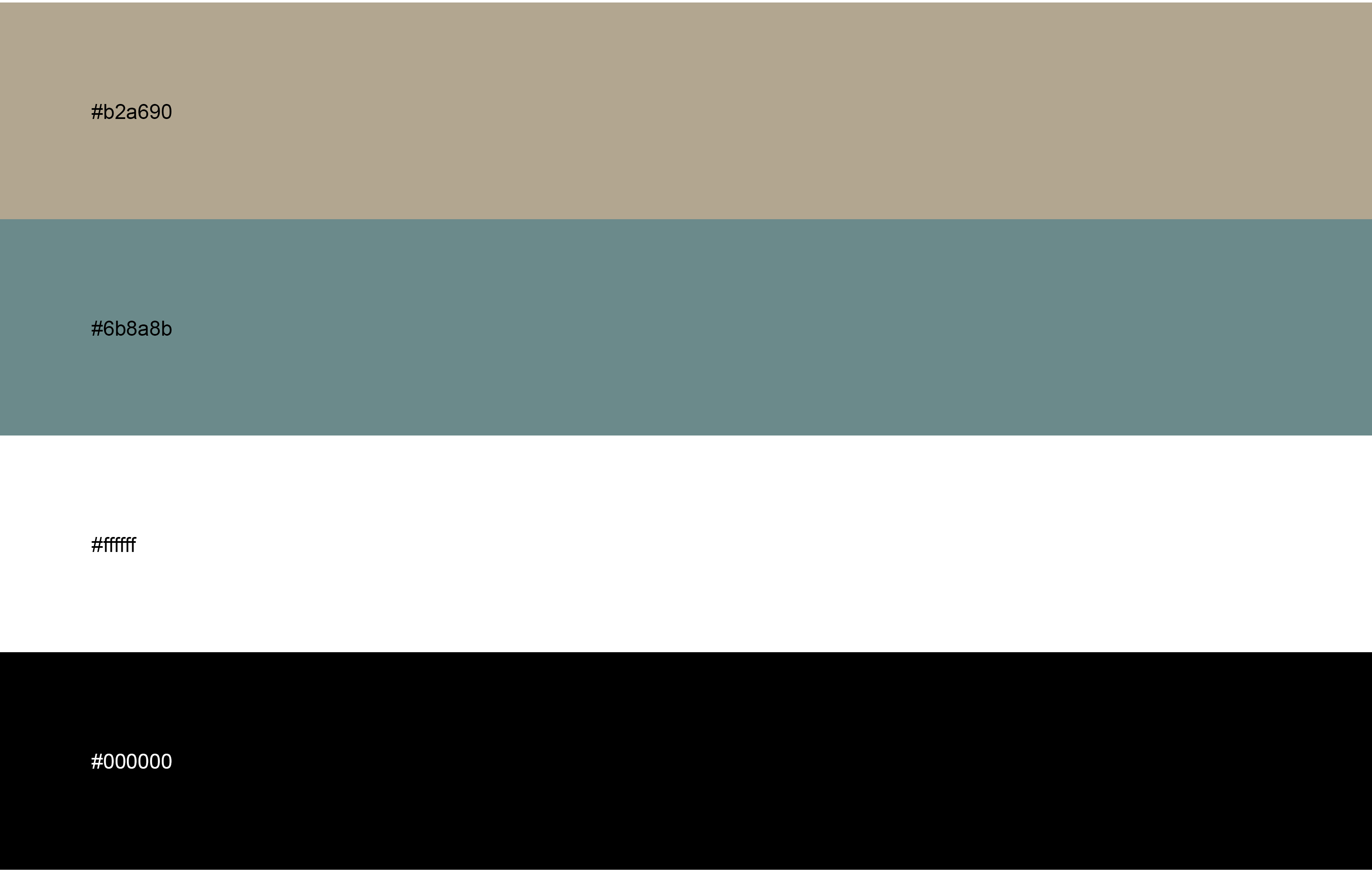
The palette uses neutral tones—beige, teal, white, and black—to create a clean, balanced look. Amador and Cinzel are used for headings to give a classic, editorial feel, while Arial is used for body text to keep it clear and easy to read. This combination creates a strong visual hierarchy that guides the viewer through the design. Overall, the color and typography work together to enhance readability while maintaining a cohesive and polished aesthetic.
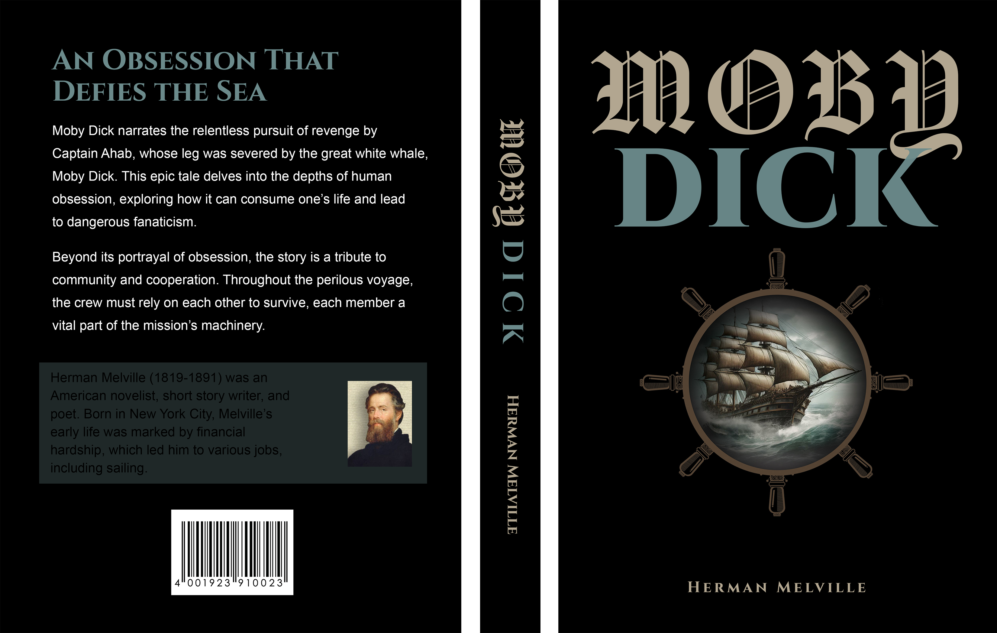
The final cover combines typography, imagery, and layout into a cohesive editorial design that captures the dramatic tone of the novel. The result is a polished print piece that emphasizes mood, storytelling, and strong visual presentation.