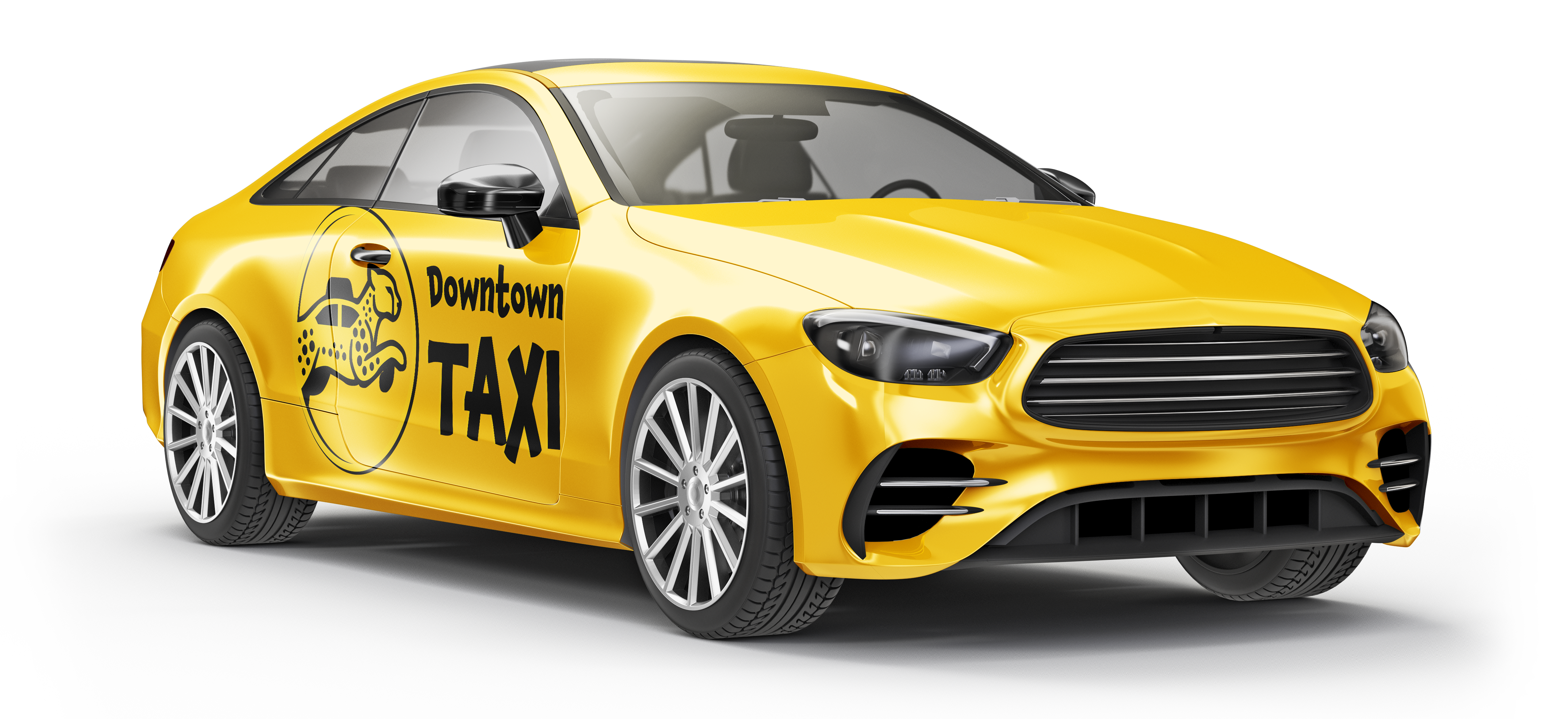
Downtown Taxi is an urban transportation service focused on speed, reliability, and professionalism. This project involved revamping an outdated logo into a modern, refined identity that better reflects the company’s efficient, city-driven service while maintaining a clean and trustworthy appearance across print materials.
The Downtown Taxi project focuses on redesigning the original logo to create a more modern and recognizable brand identity. The previous logo lacked visual impact and did not reflect the company’s fast-paced, professional service. The updated design introduces a clean, bold look supported by a cohesive stationery system, including business cards, letterheads, and envelopes, ensuring a consistent and professional presence across all print materials.

The original logo felt outdated and did not reflect the company’s fast, reliable, and professional service.
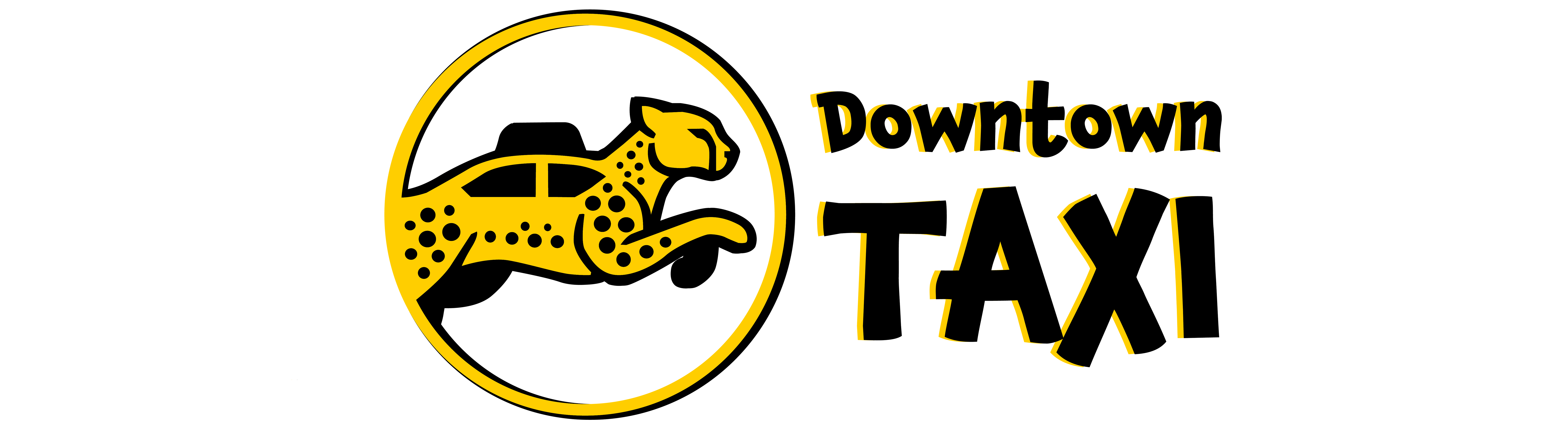
The updated identity uses a cleaner, bolder, and more modern visual style to improve recognition and create a stronger brand presence.
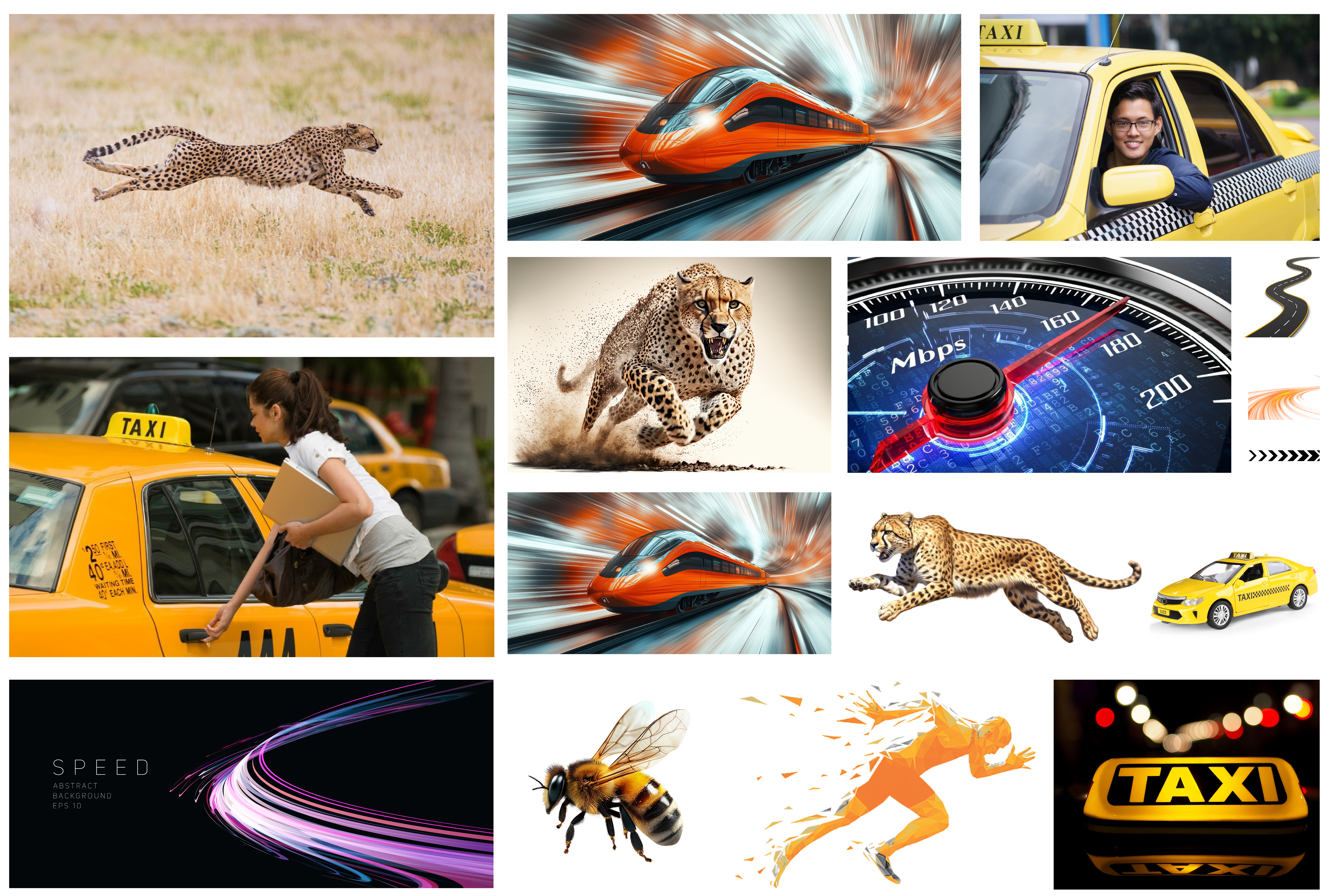
The mood board explores themes of speed, motion, and urban energy through dynamic imagery and bold visual cues. Elements such as fast-moving vehicles, motion blur, and directional lines help establish a brand direction that feels efficient, modern, and fast-paced, reflecting Downtown Taxi’s focus on reliability and quick service in a busy city environment.

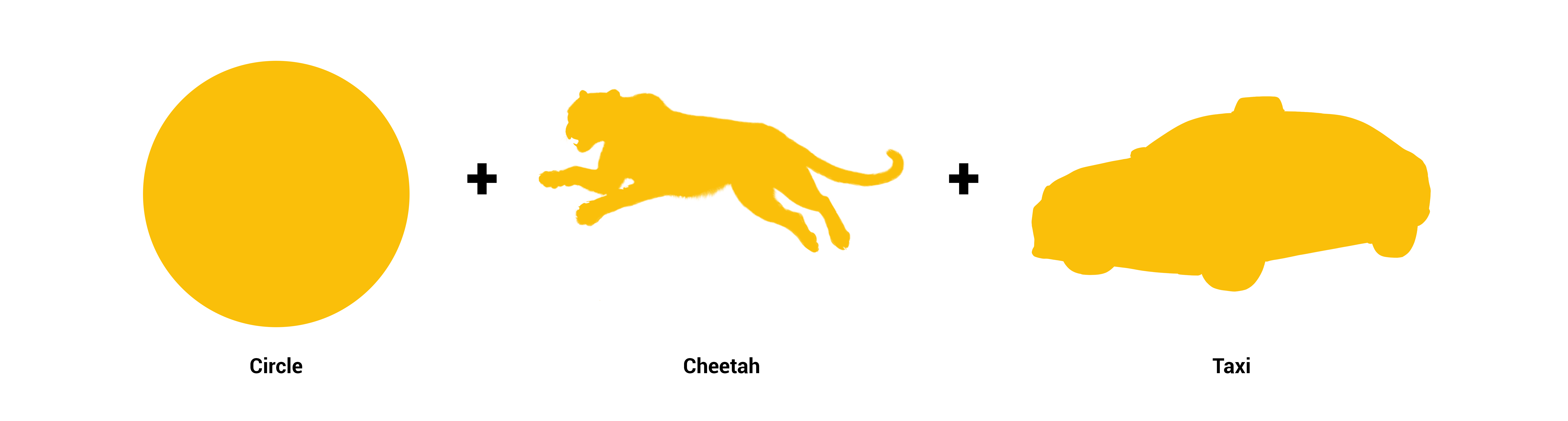
Initial sketches explored visual ideas centered around speed, motion, and urban transportation. Concepts such as the cheetah symbolized speed, while the taxi and circular forms represented movement and accessibility. Through iteration, these elements were simplified into a clean, modern mark that captures efficiency and reliability while maintaining strong visual recognition.
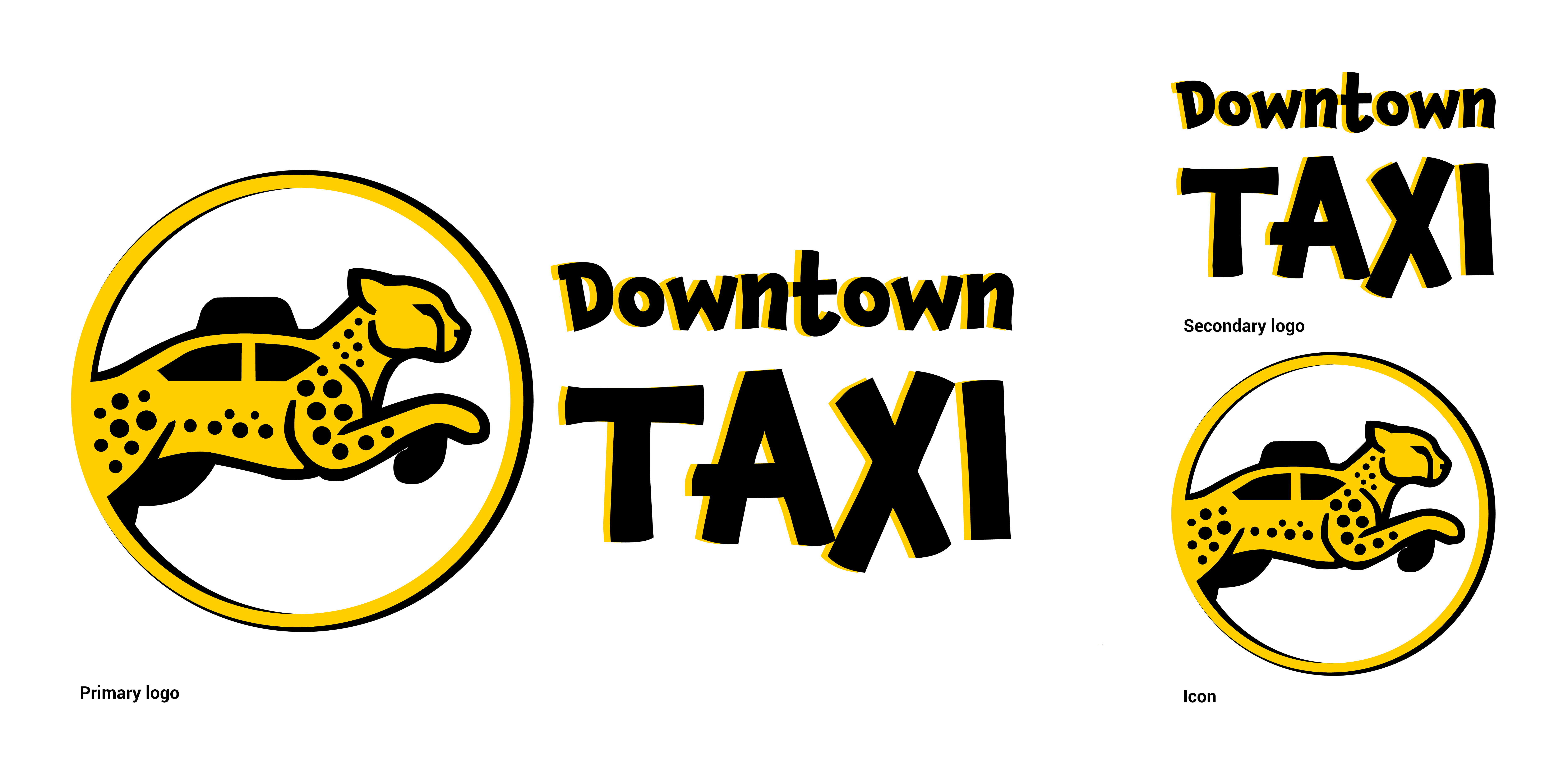
The final logo combines a cheetah and taxi silhouette within a circular form to represent speed, movement, and urban transportation. The cheetah symbolizes quick and efficient service, while the taxi element reinforces the brand’s core function. The bold typography and high-contrast yellow and black color palette enhance visibility and recognition, creating a modern and memorable identity that reflects Downtown Taxi’s fast and reliable service.
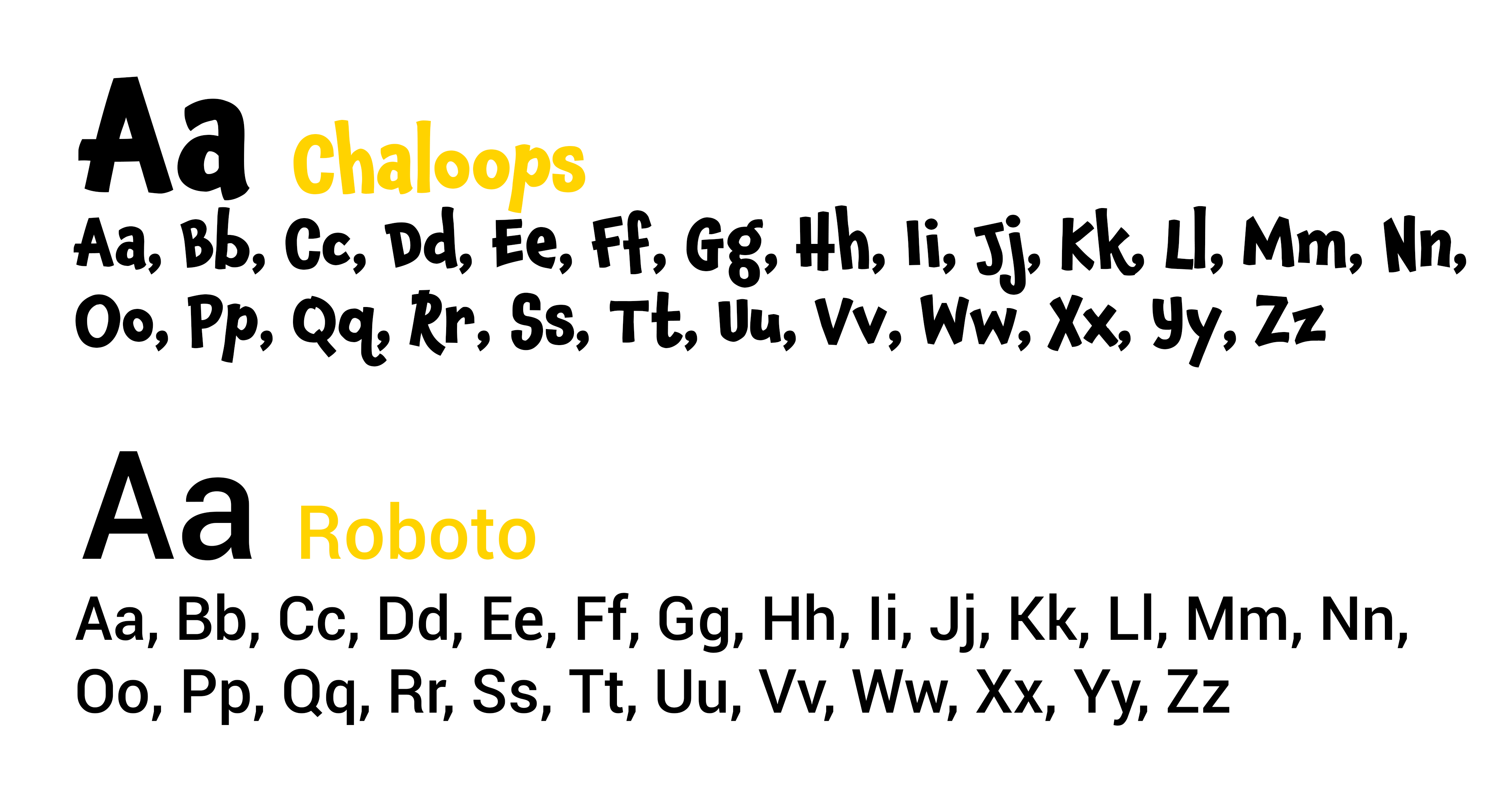
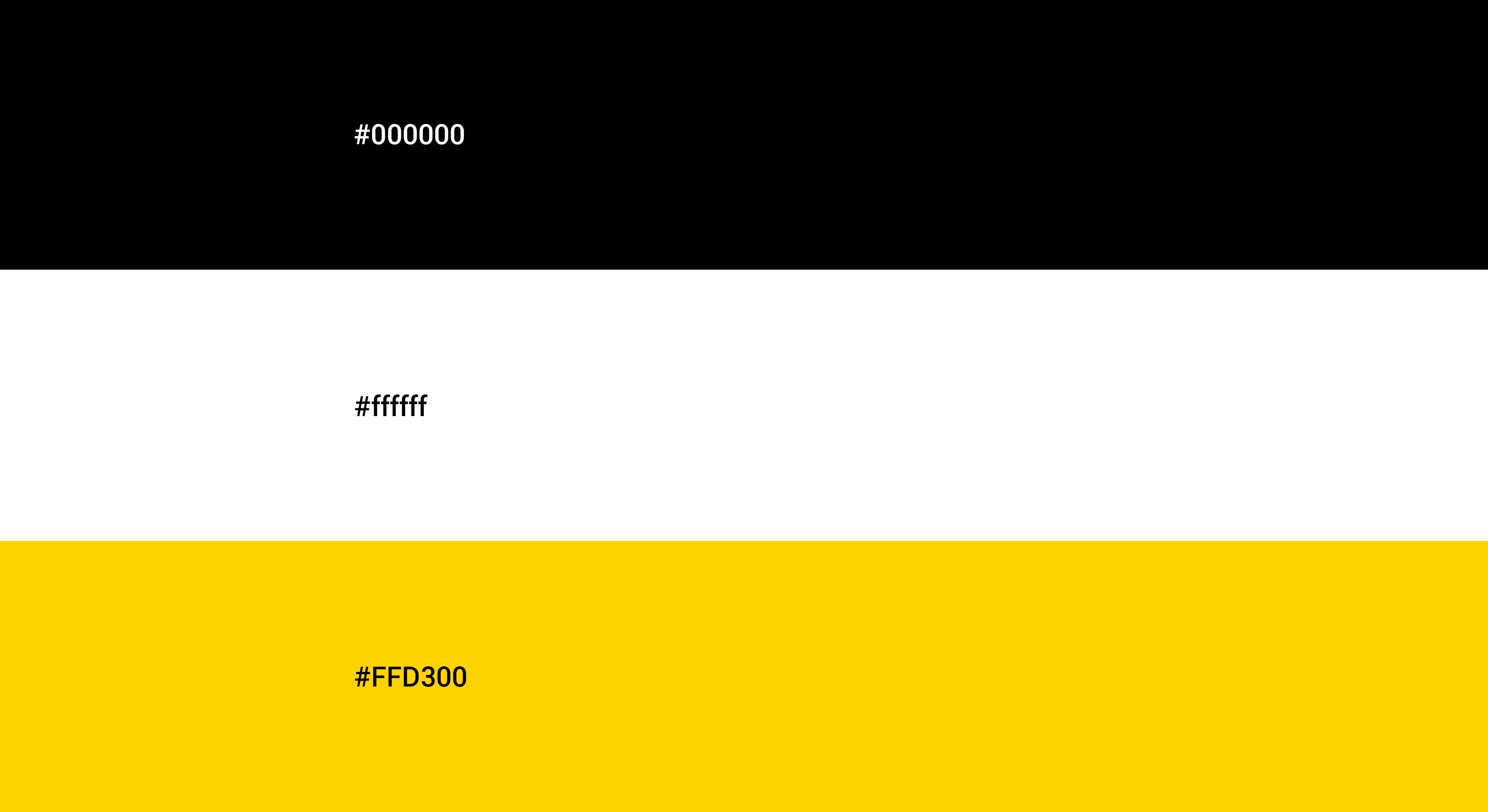
The typography pairs a bold, playful display font (Chaloops) with a clean, readable sans-serif (Roboto) for balance and clarity. The color palette of yellow, black, and white creates a high-contrast, recognizable identity-yellow for visibility, black for strength, and white for simplicity.
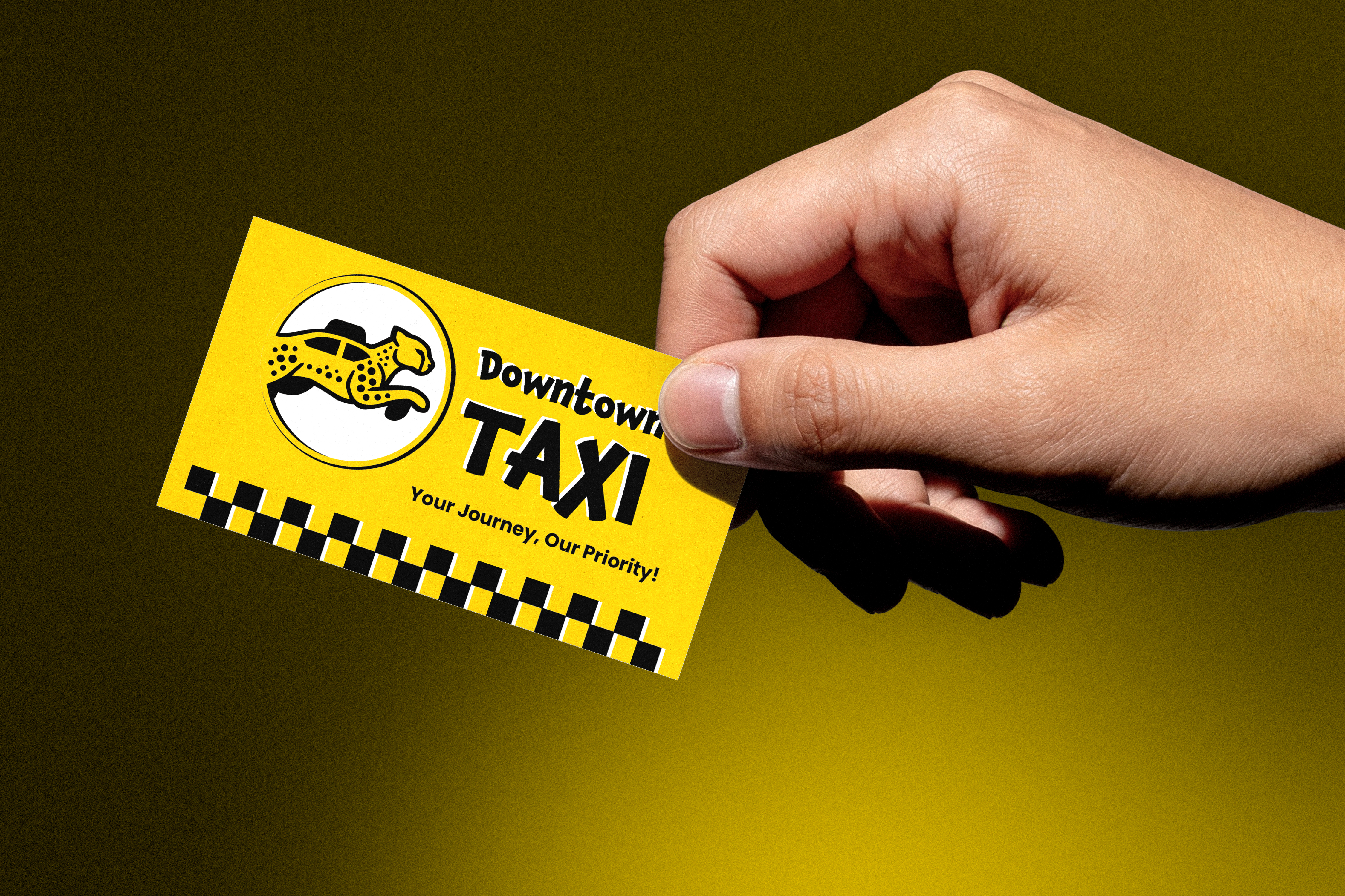
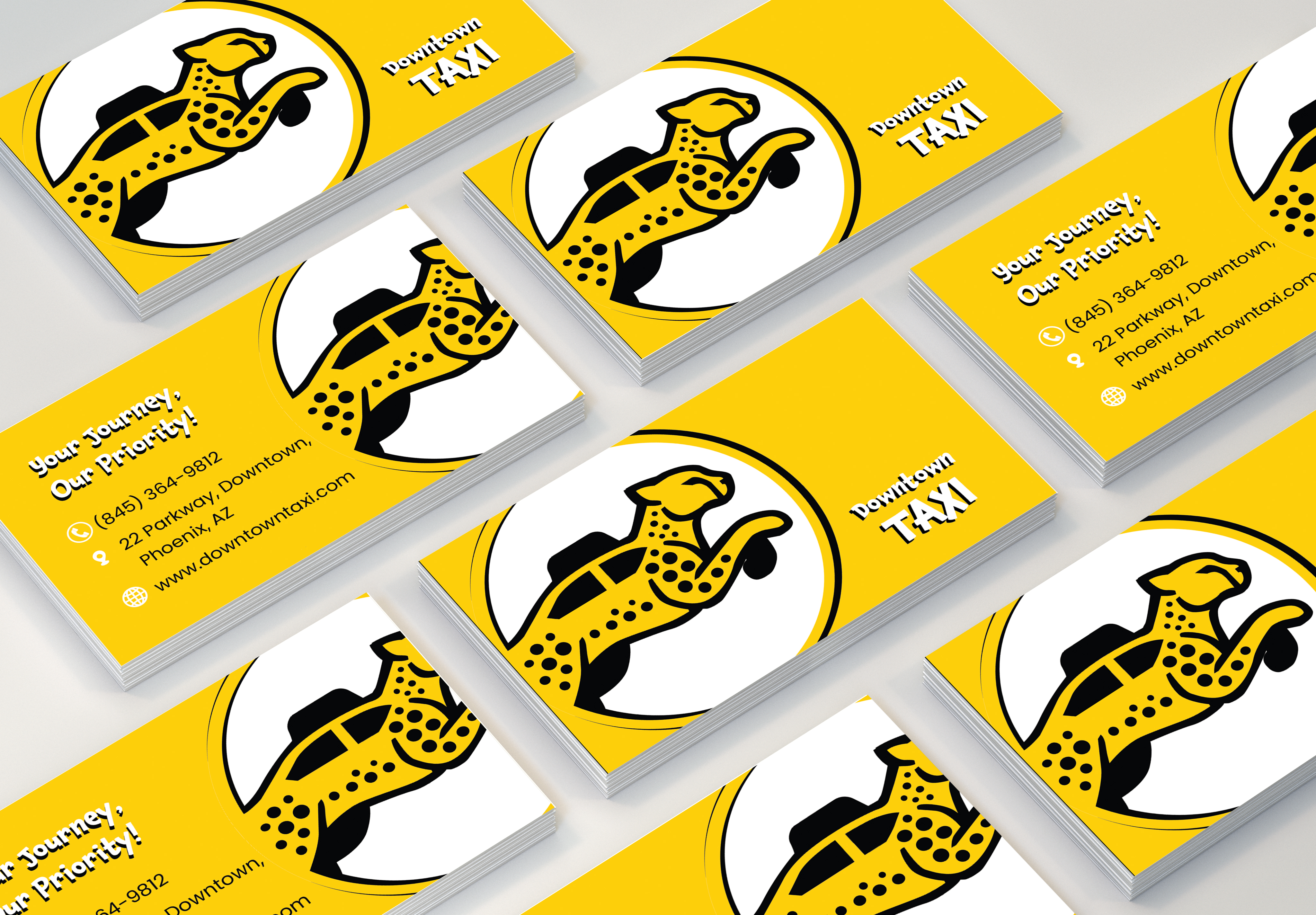
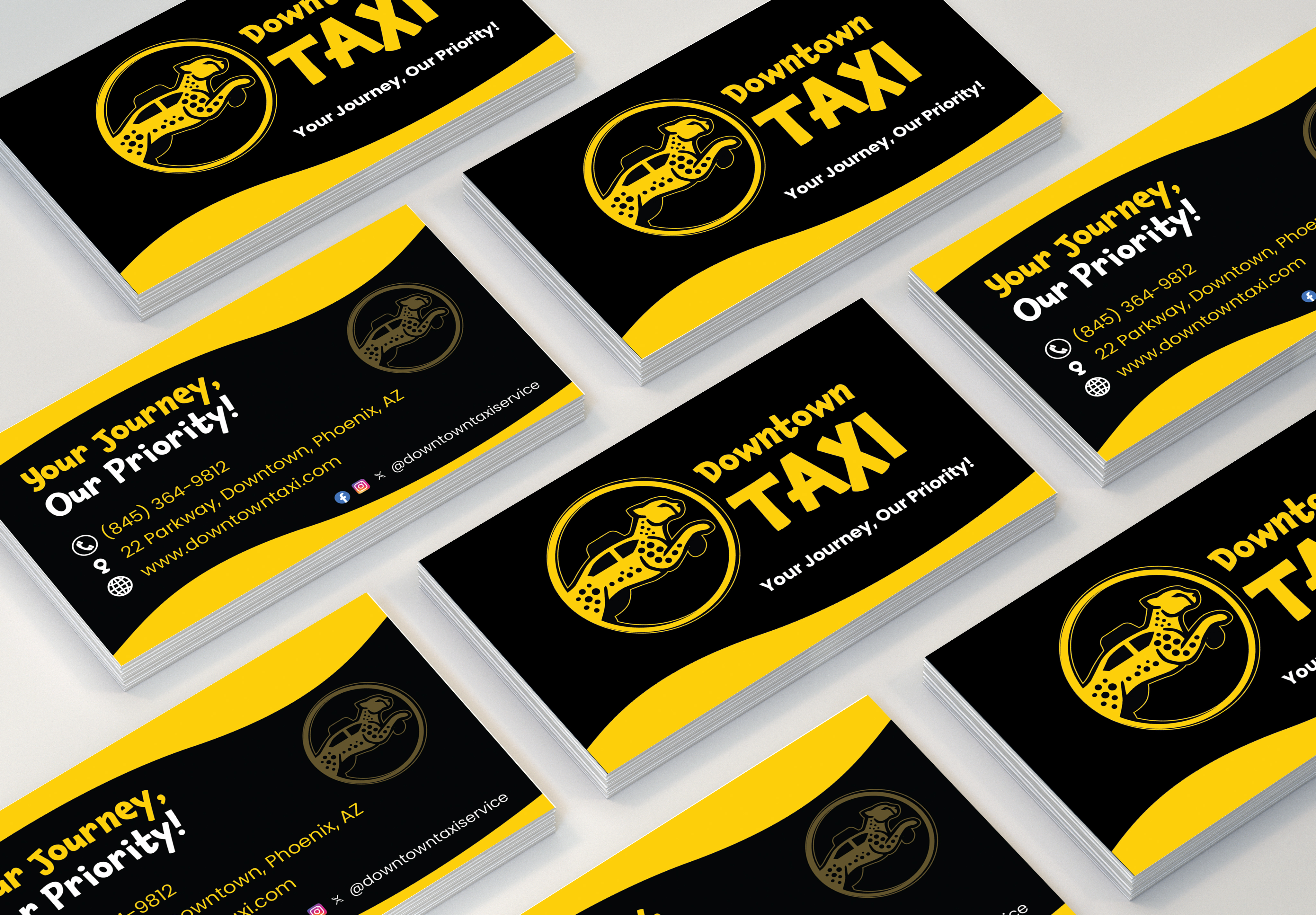
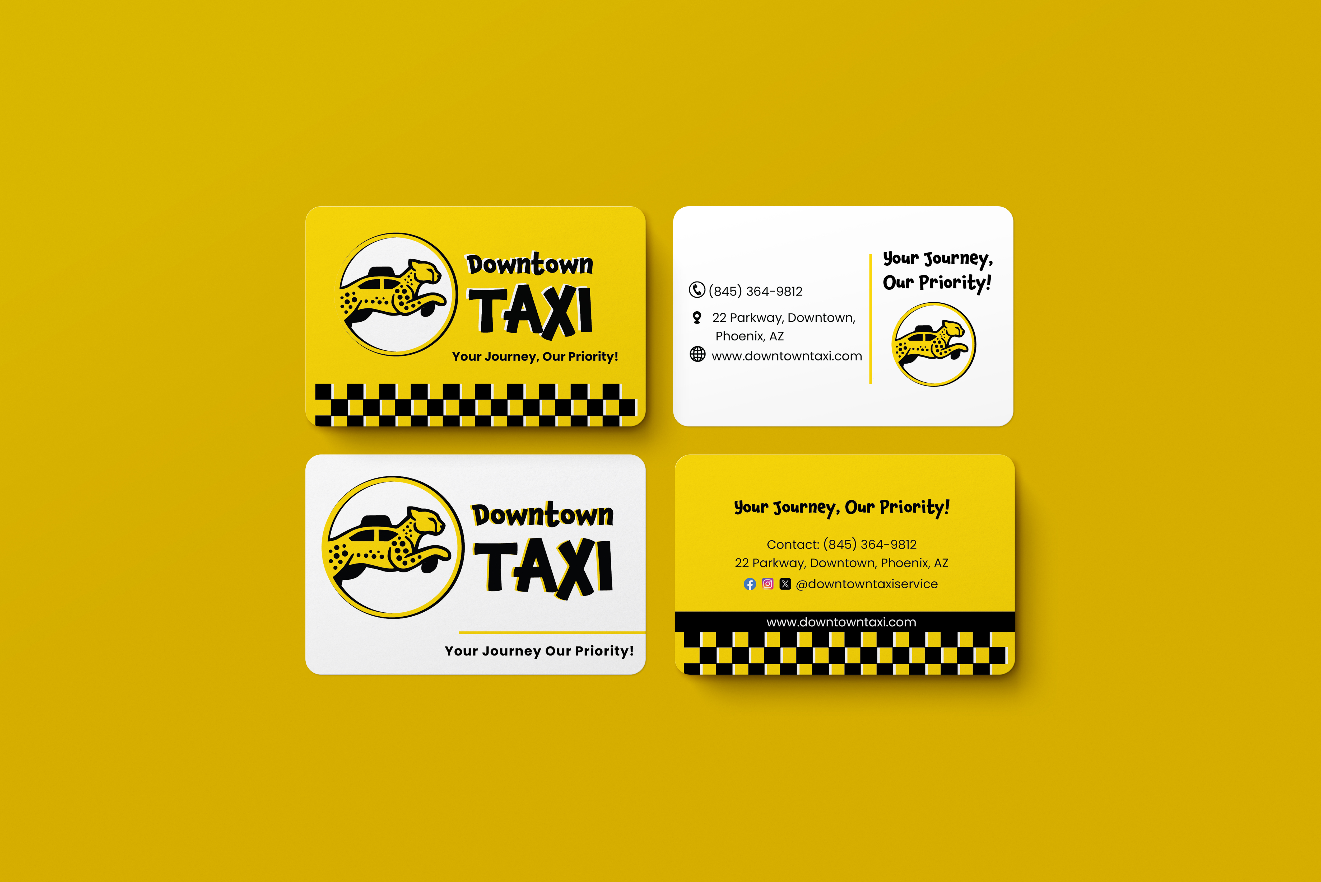
The business cards use bold typography and high-contrast yellow and black colors to create strong brand recognition. The front highlights the logo, while the back presents clear, easy-to-read contact information.
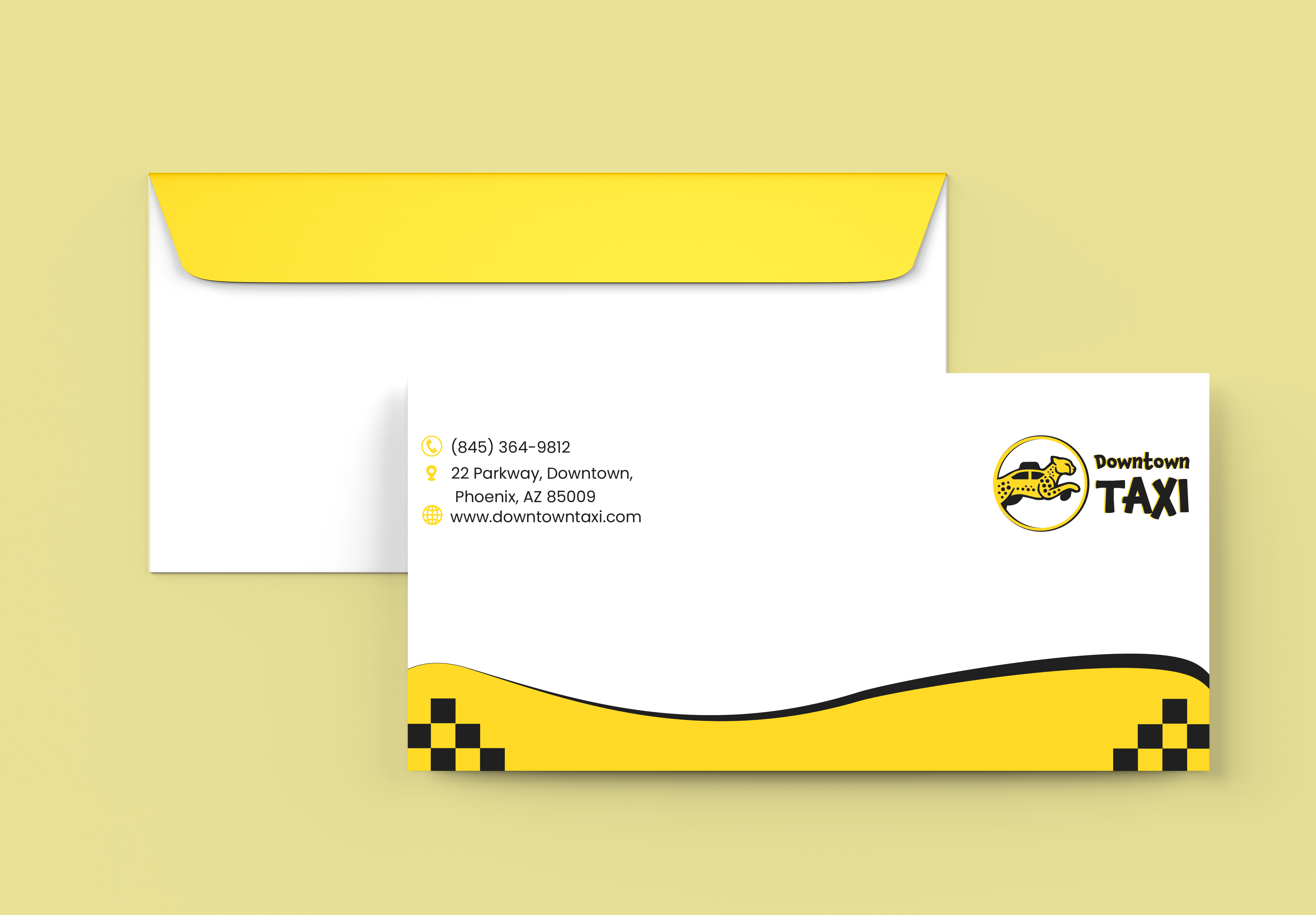
The envelope design maintains brand consistency with a clean layout, bold yellow and black color scheme, and subtle taxi-inspired details. The logo and contact information are clearly presented, creating a professional and recognizable print piece.
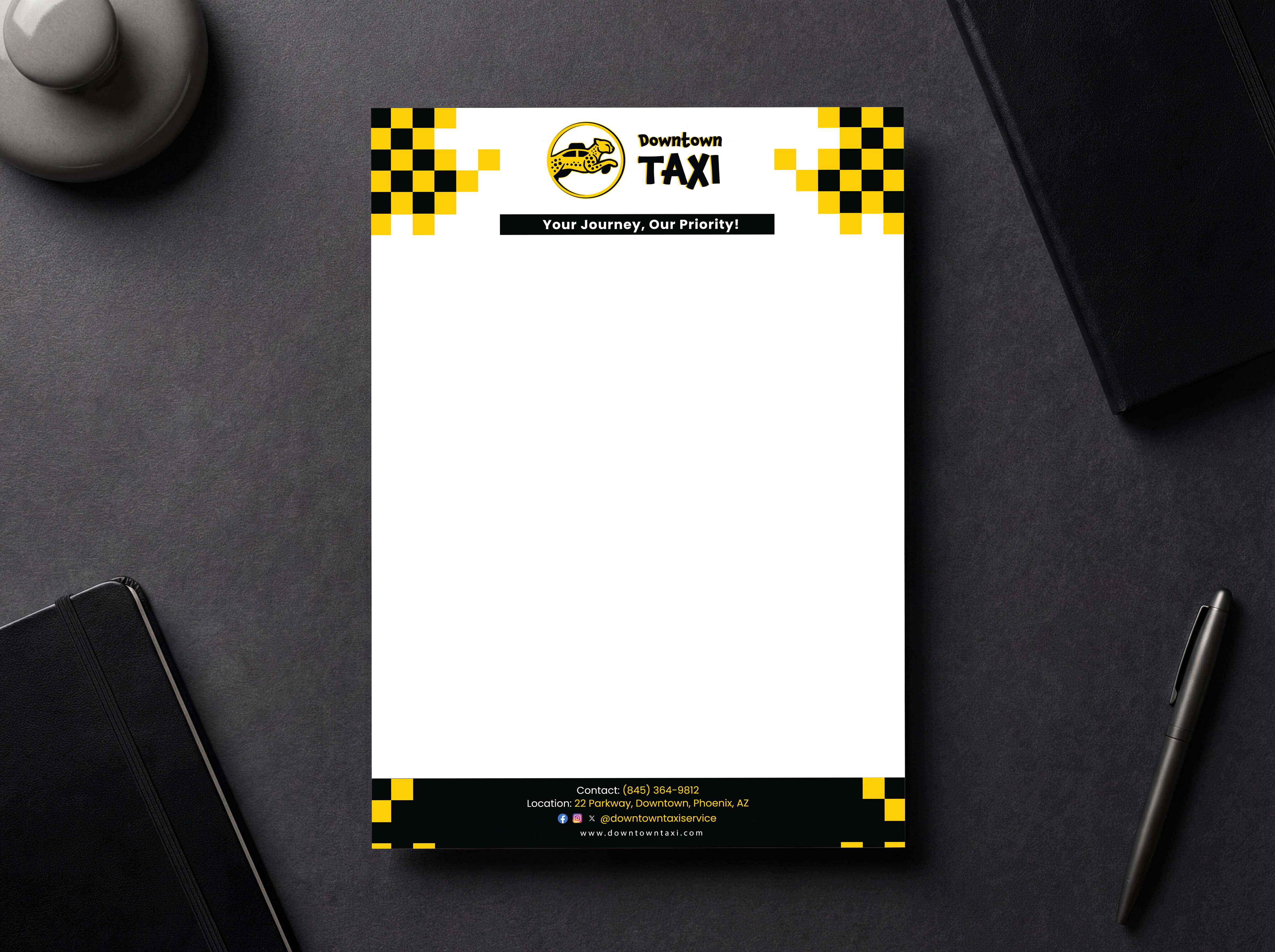
The letterhead design uses a clean layout with bold yellow and black accents to reinforce the brand identity. The logo and key details are clearly positioned, while the checker pattern adds a subtle taxi-inspired touch, creating a professional and consistent print piece.
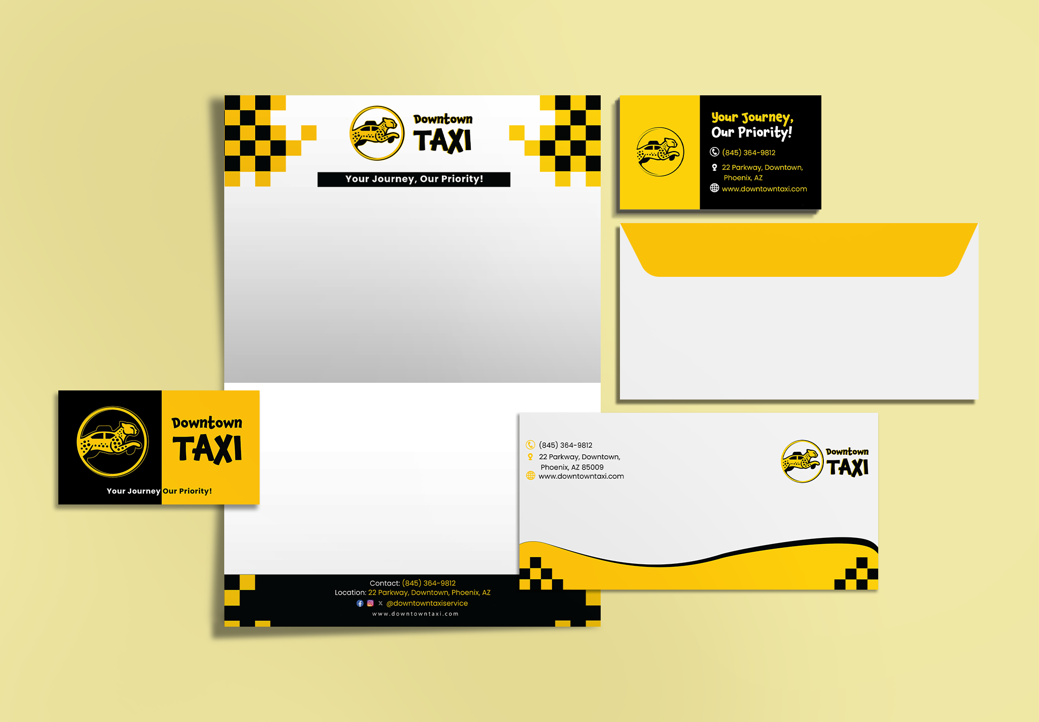
This final mockup showcases the complete Downtown Taxi stationery system, including business cards, letterhead, and envelopes. Consistent use of bold yellow and black colors, typography, and taxi-inspired elements creates a unified and professional brand presence across all print materials.