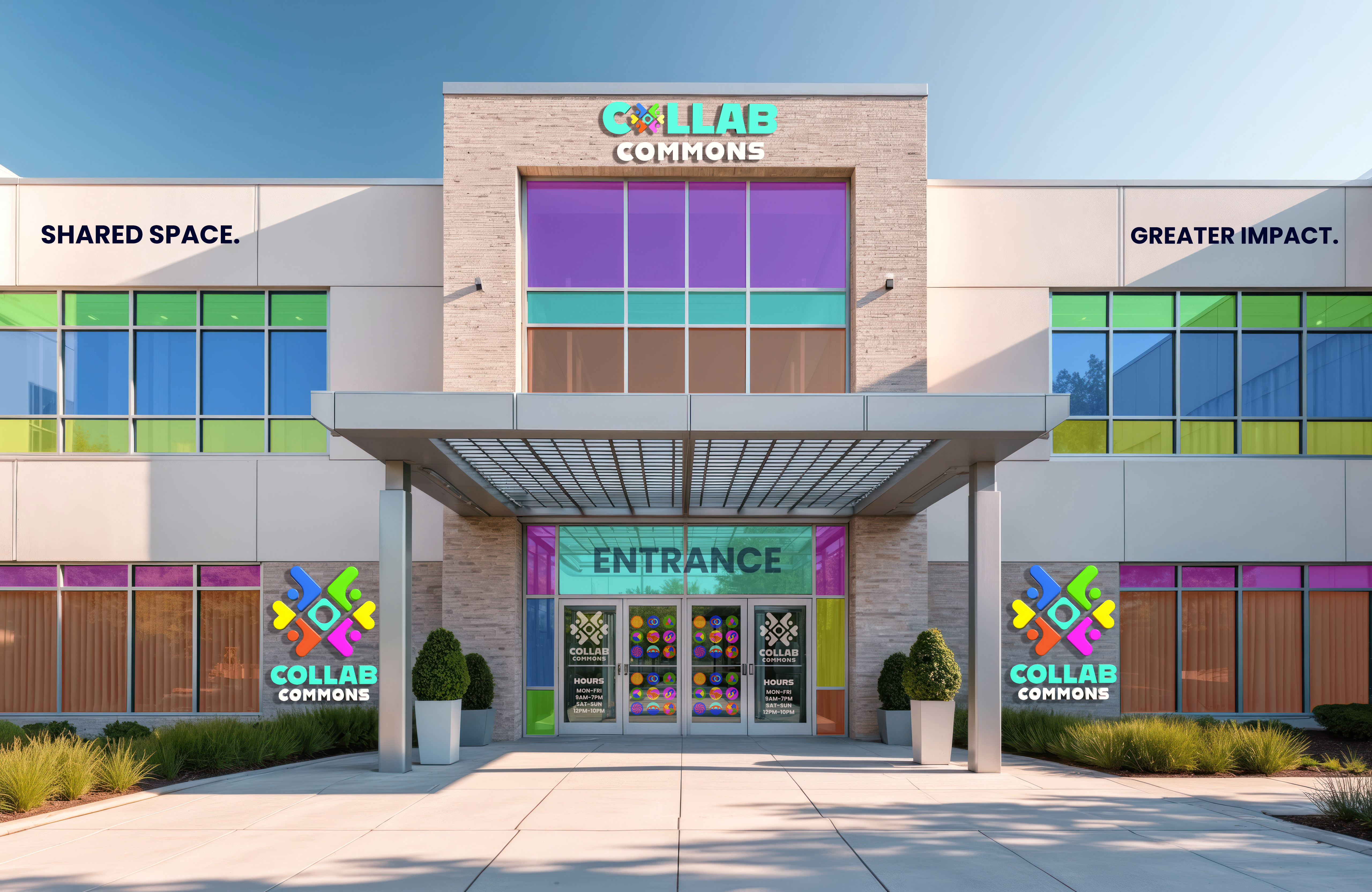
Collab Commons is a community-centered brand concept focused on collaboration, creativity, and shared experiences. The identity extends beyond traditional branding into environmental and spatial design, transforming physical spaces through cohesive visuals, interior applications, and branded touchpoints.
Collab Commons was developed as a brand experience that brings identity into both print and physical environments. The goal was to create a system that felt welcoming, modern, and flexible enough to live across signage, branded interiors, promotional materials, and wayfinding. This project explores how branding can shape a space and create a stronger sense of community and interaction.
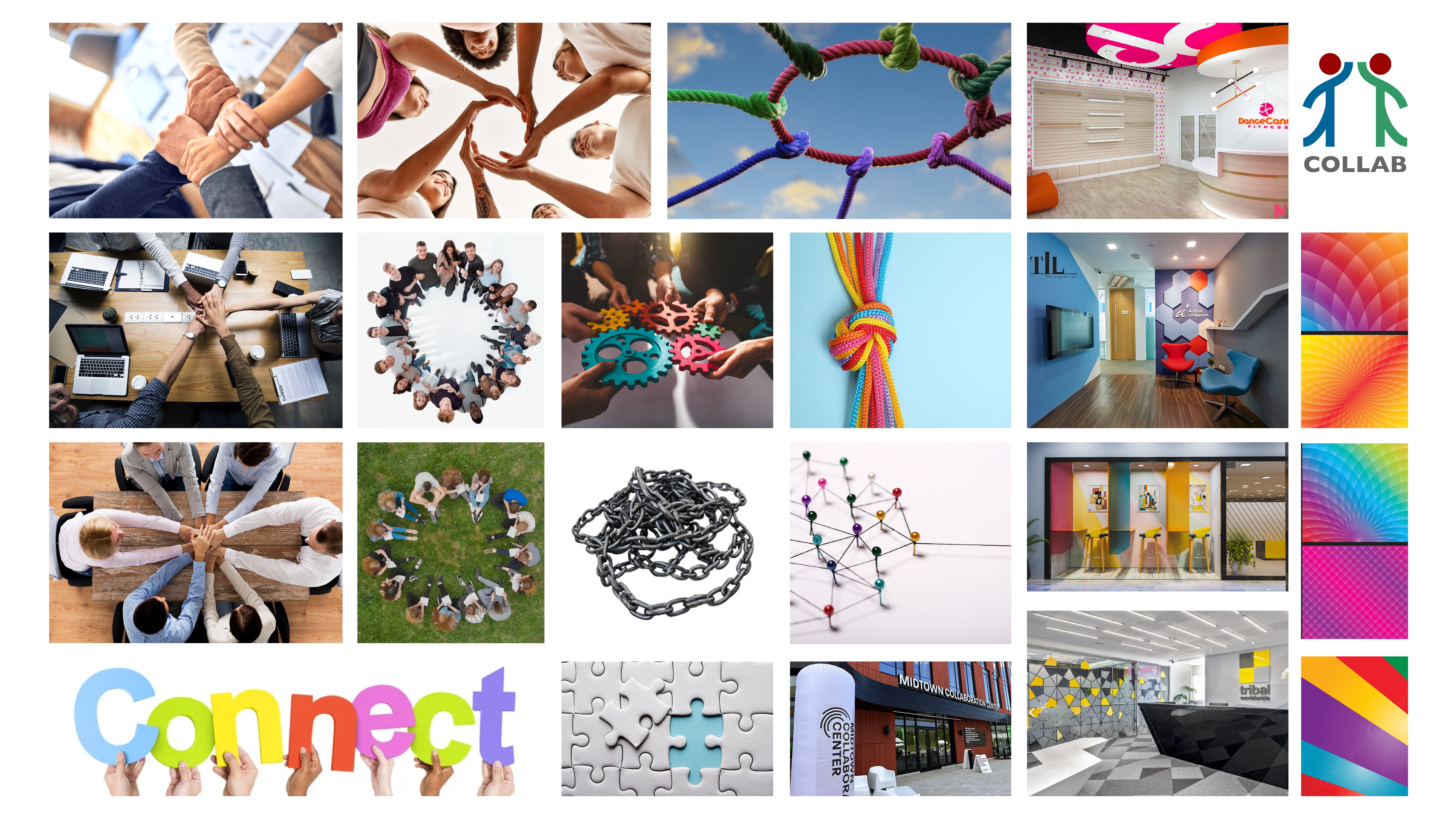
The mood board explores modern collaborative spaces, clean architectural forms, community-driven visuals, and contemporary color palettes. It helped establish a direction that feels inviting, creative, and professional while supporting the idea of connection and shared purpose.

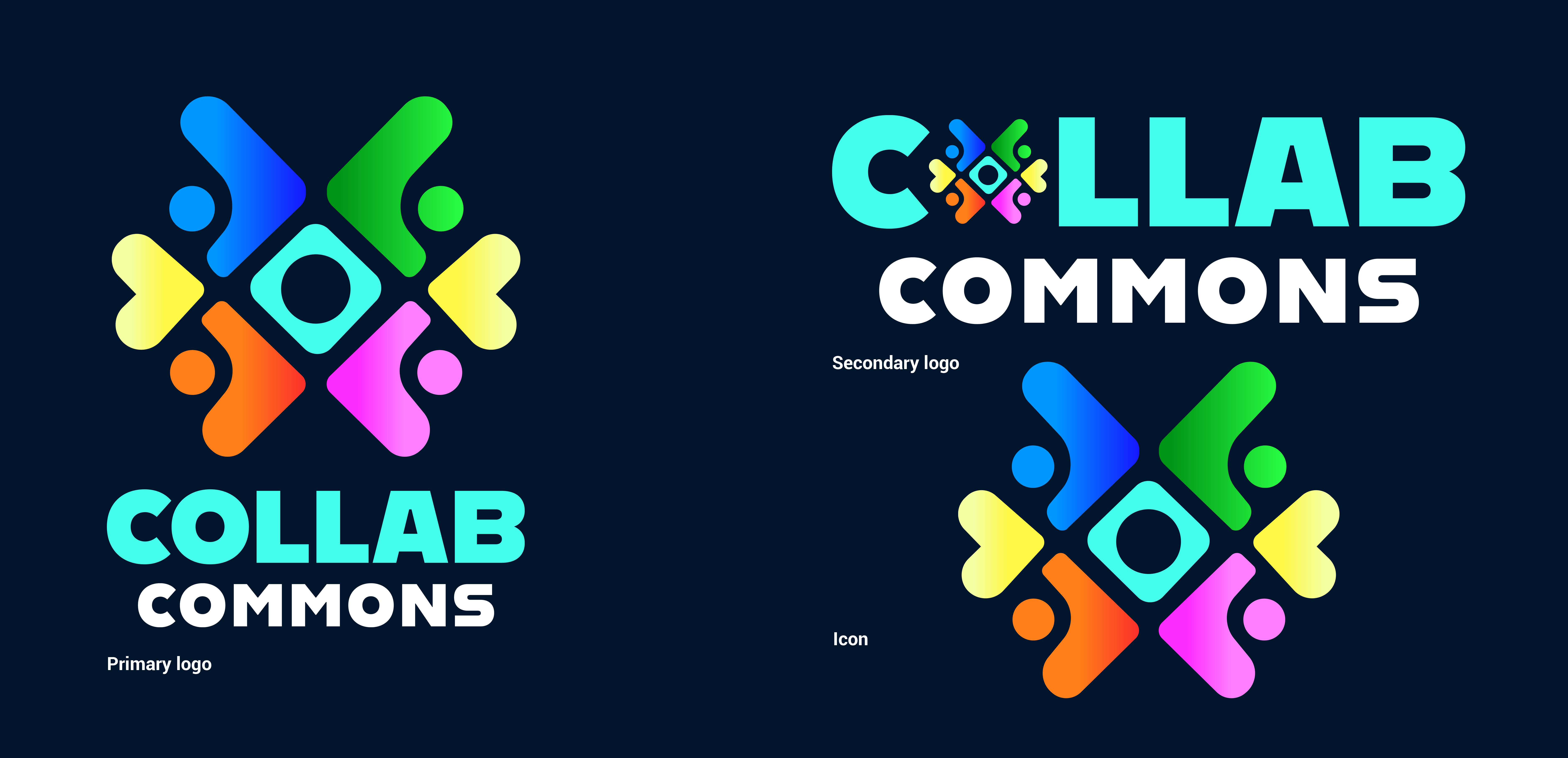
Initial sketches explored abstract symbols representing connection, collaboration, and community. Different forms and layouts were tested to create a simple, balanced mark that visually communicates people coming together.The final logo combines a bold geometric icon with clean typography to create a modern, flexible identity. The system is designed to work across digital, print, and environmental applications while clearly communicating community and connection.
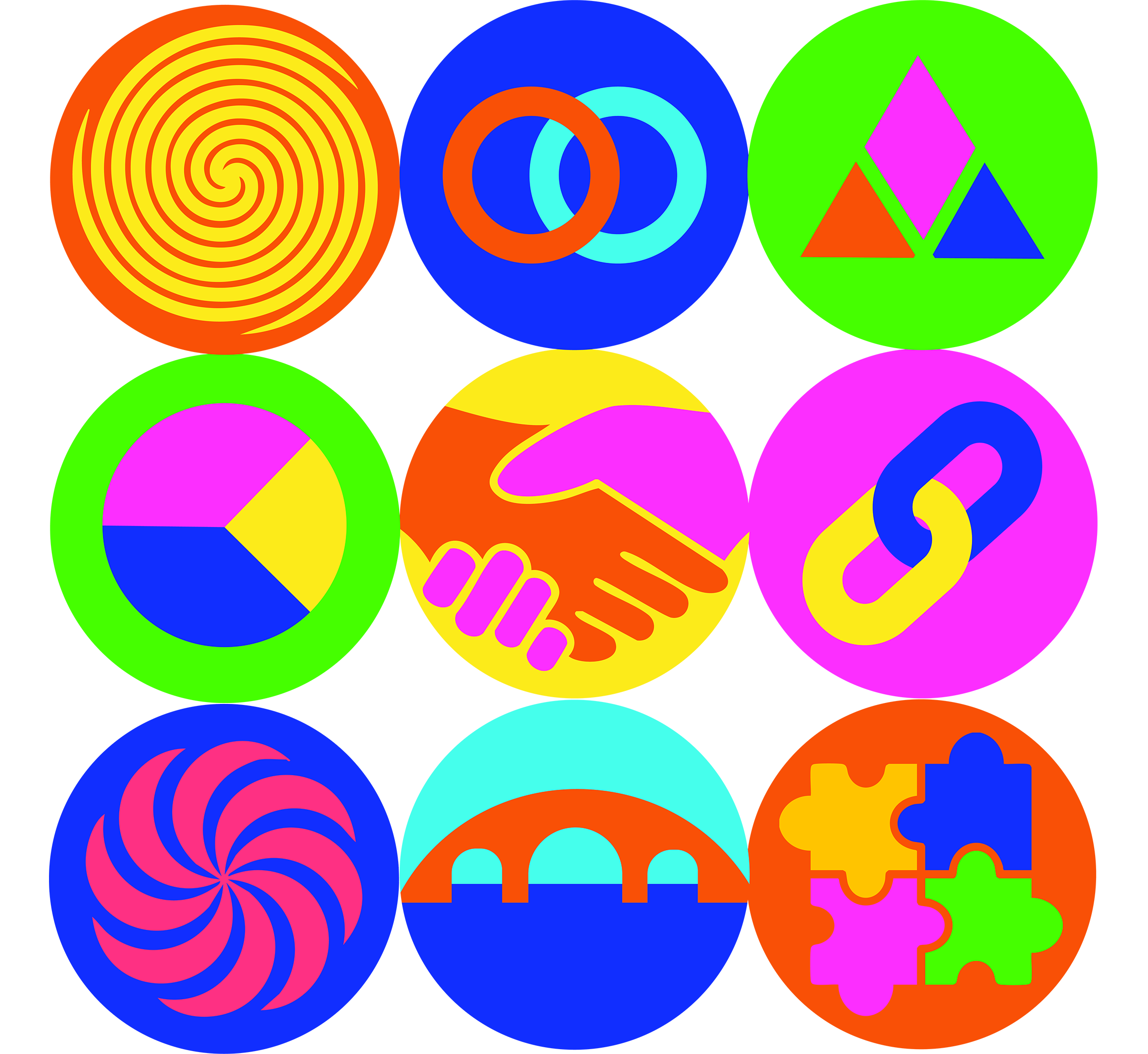
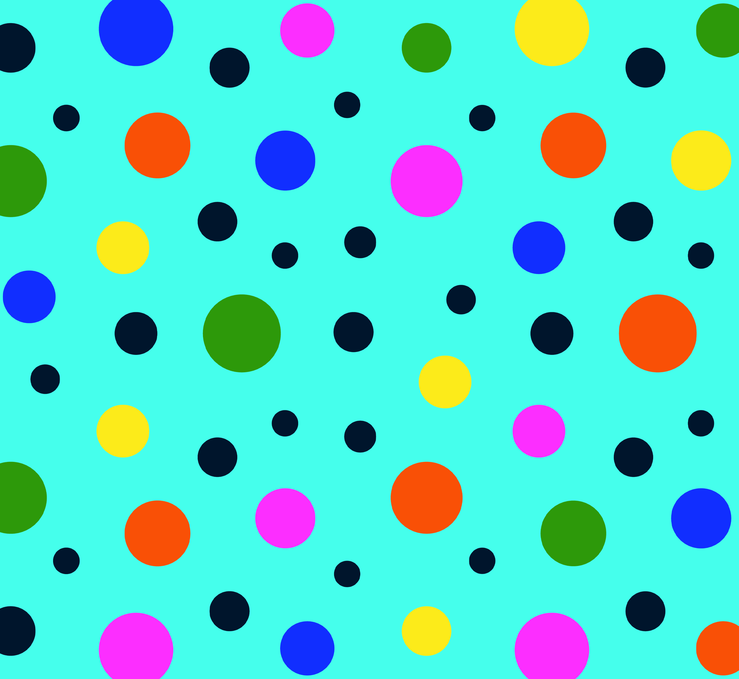
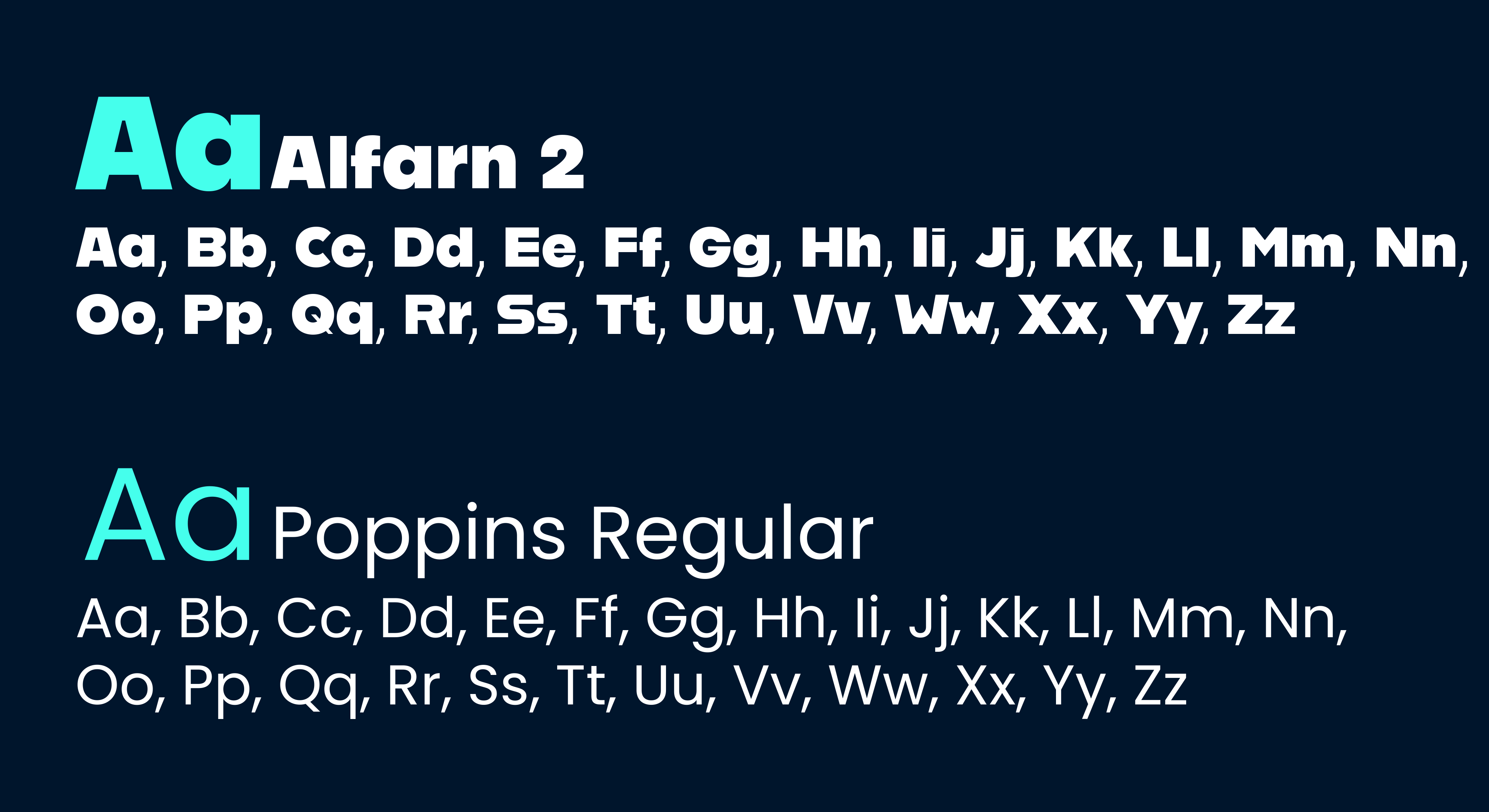

The brand elements use a vibrant color palette and bold graphic shapes to represent energy, diversity, and collaboration. Circular forms and repeating patterns reinforce the idea of connection and community, while maintaining a playful and approachable visual tone. The typography combines a strong, modern display font (Alfarn 2) with a clean, readable typeface (Poppins) to create a clear hierarchy and balance between personality and functionality.
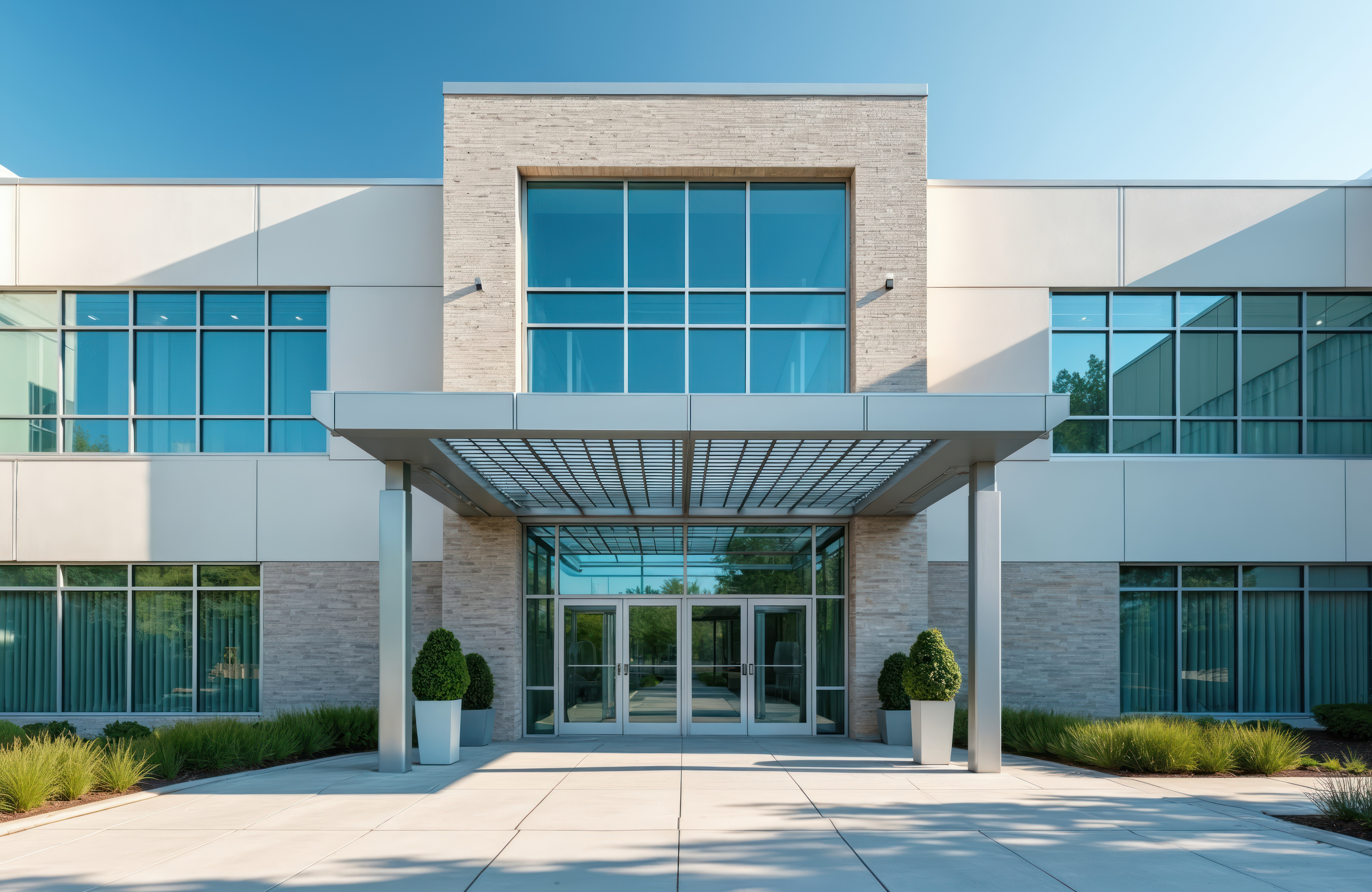
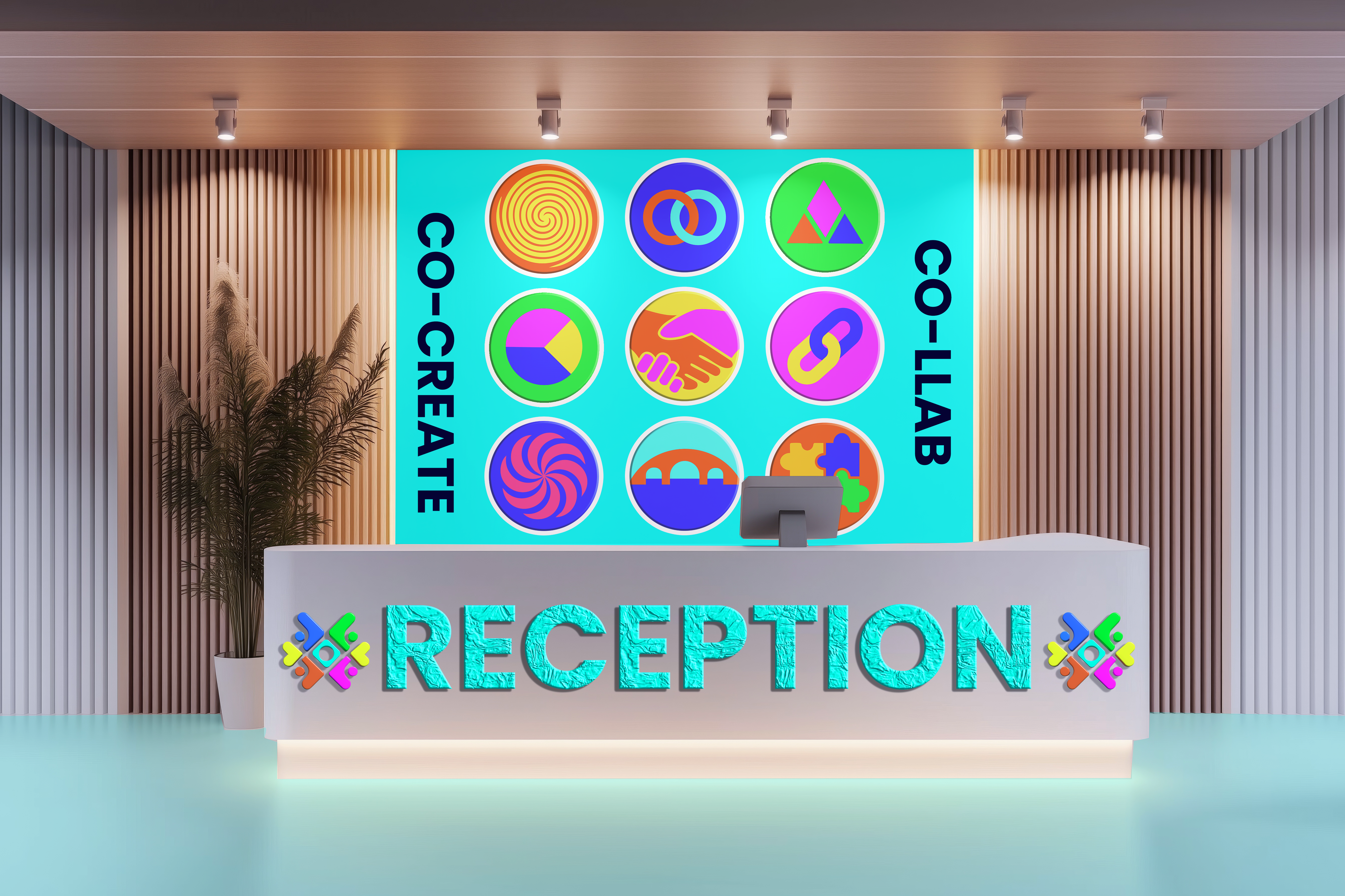
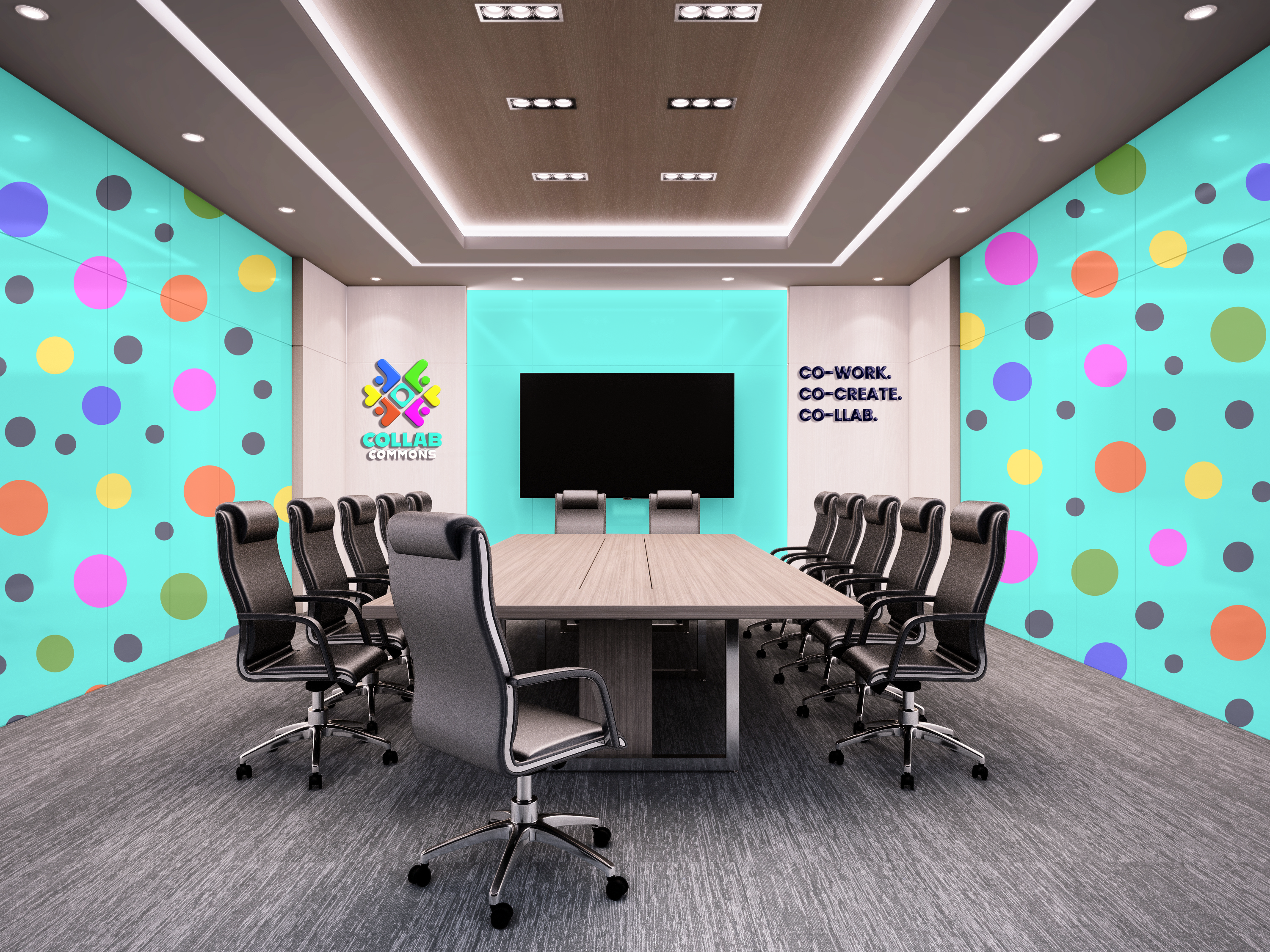
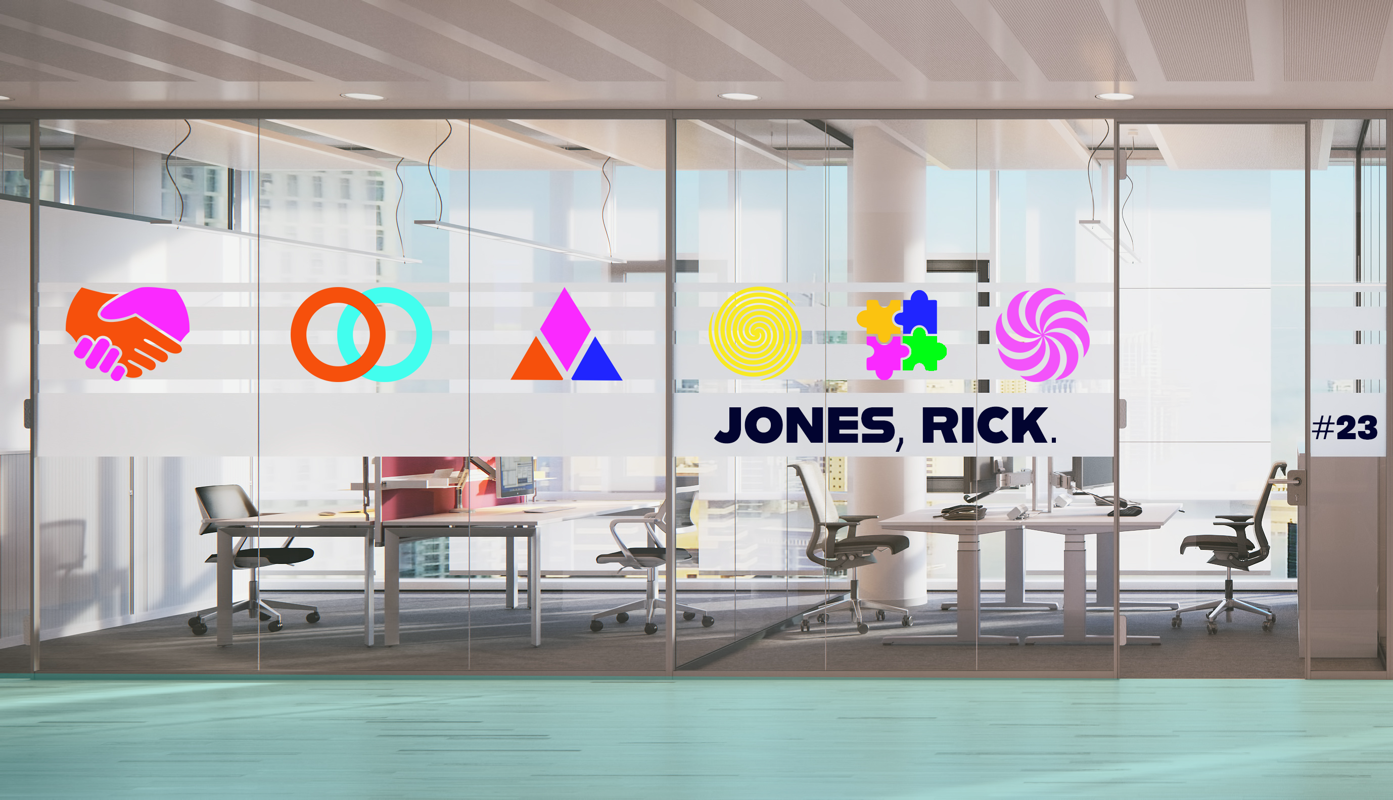
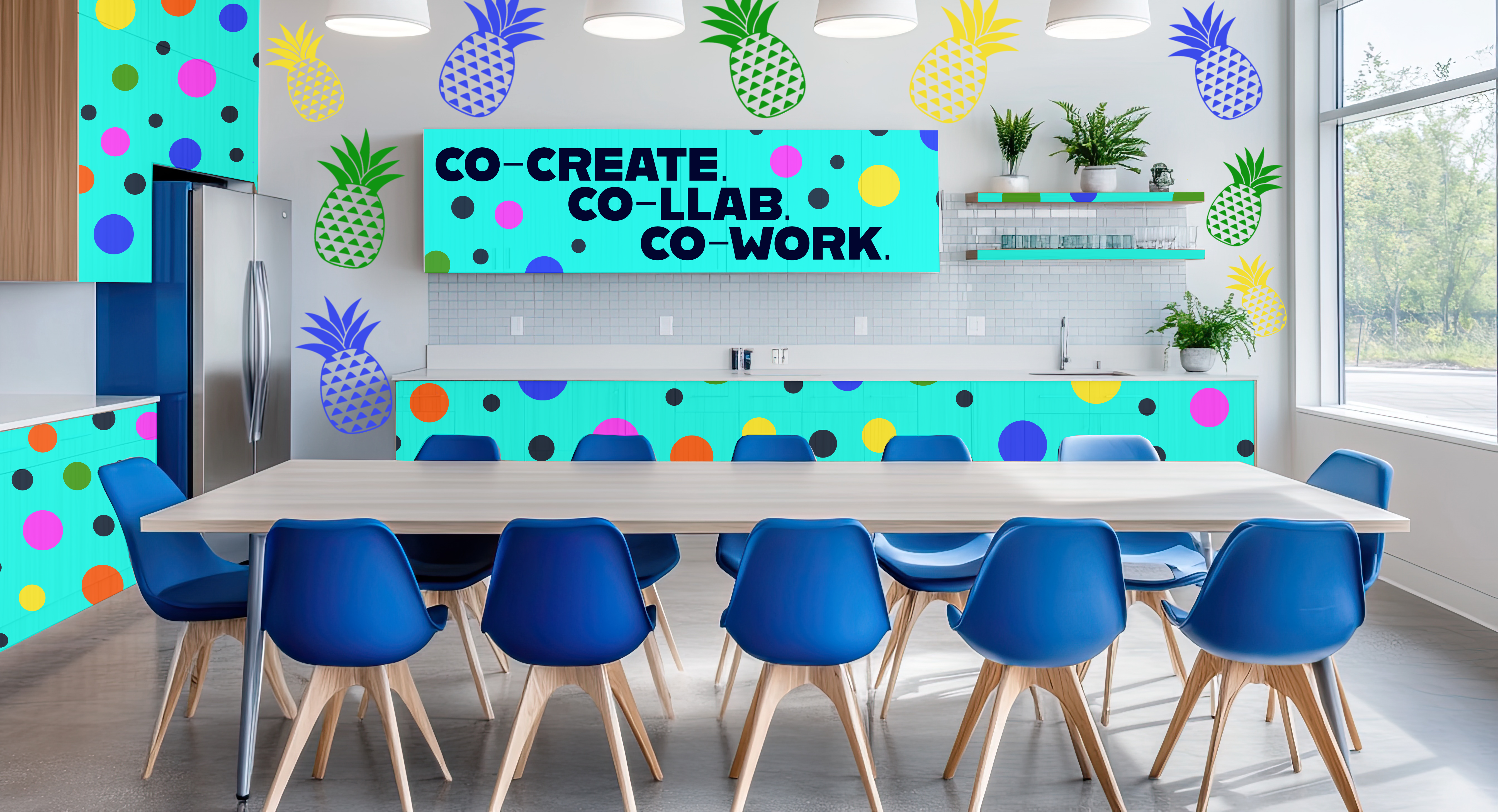
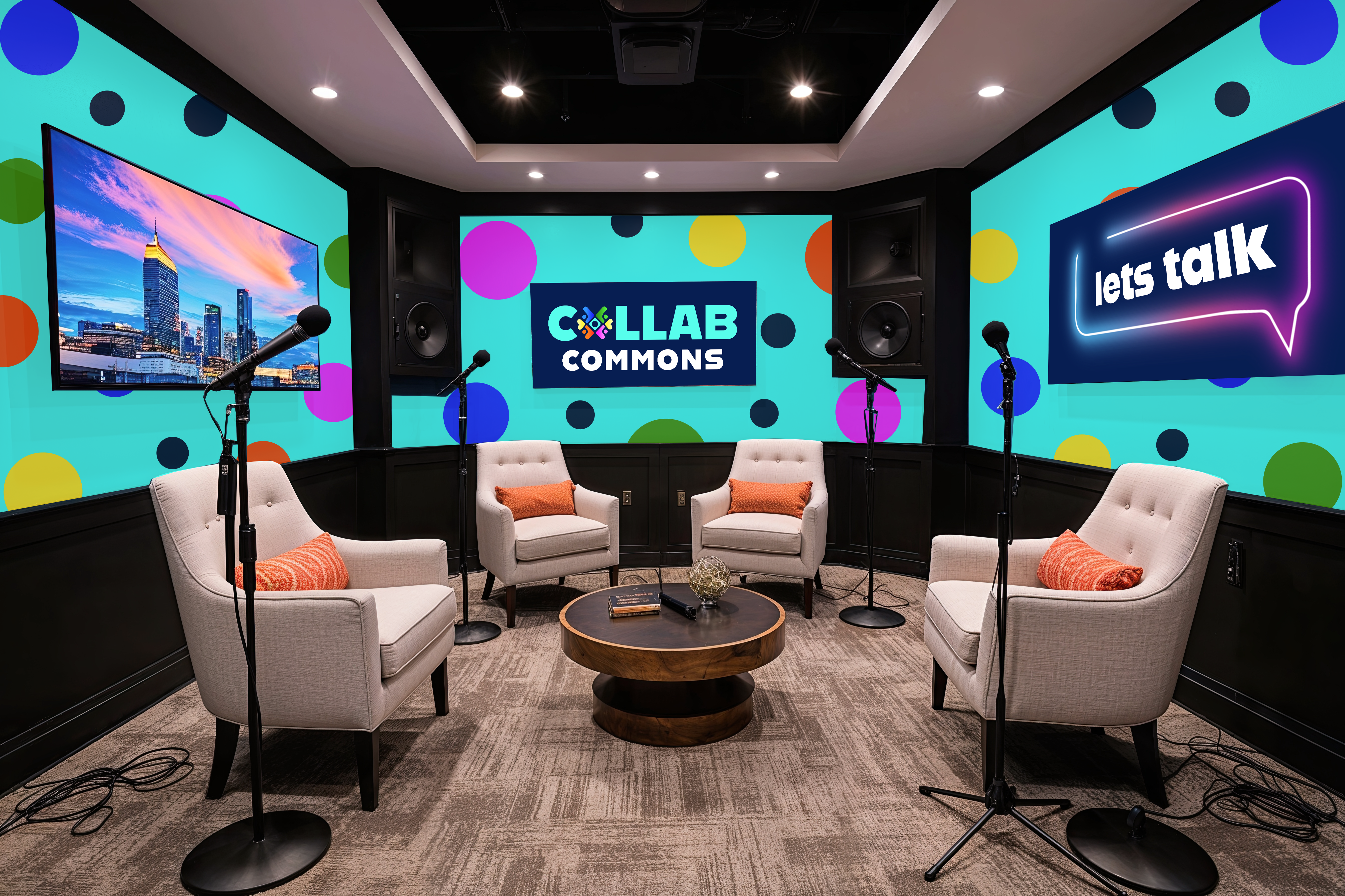
This project extends the brand into physical space through exterior branding and interior graphics. The goal was to transform the building into an immersive branded experience where every touchpoint supports the identity and strengthens the overall sense of place.

The social media designs use bold visuals, vibrant color, and community-focused imagery to create engaging and consistent content. Each post reinforces the brand’s message of collaboration and connection while maintaining a strong and recognizable visual identity across platforms.
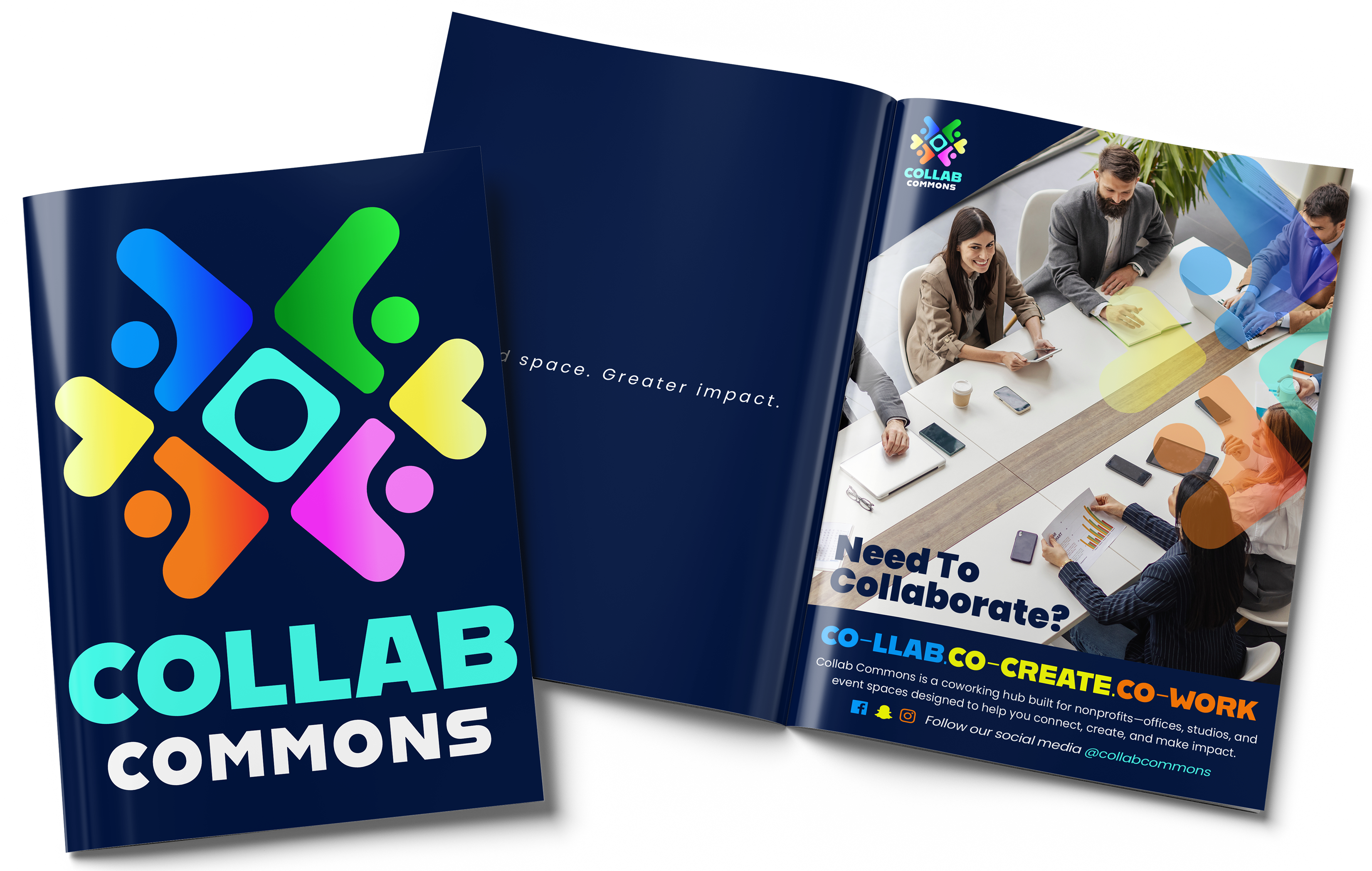
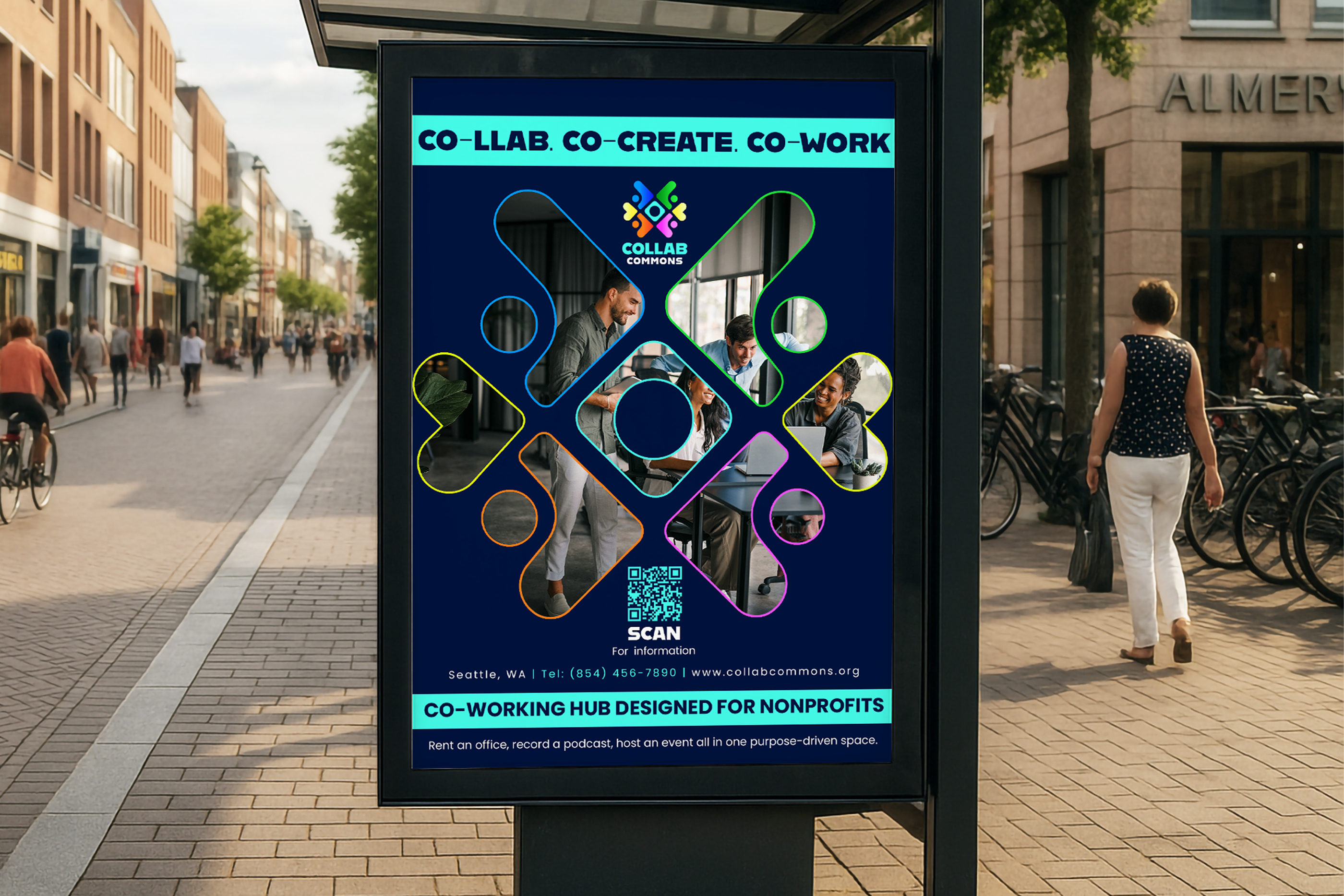
The print ads use bold visuals and consistent branding across billboards, bus stops, and magazines to create a cohesive and high-impact campaign that promotes collaboration and community.
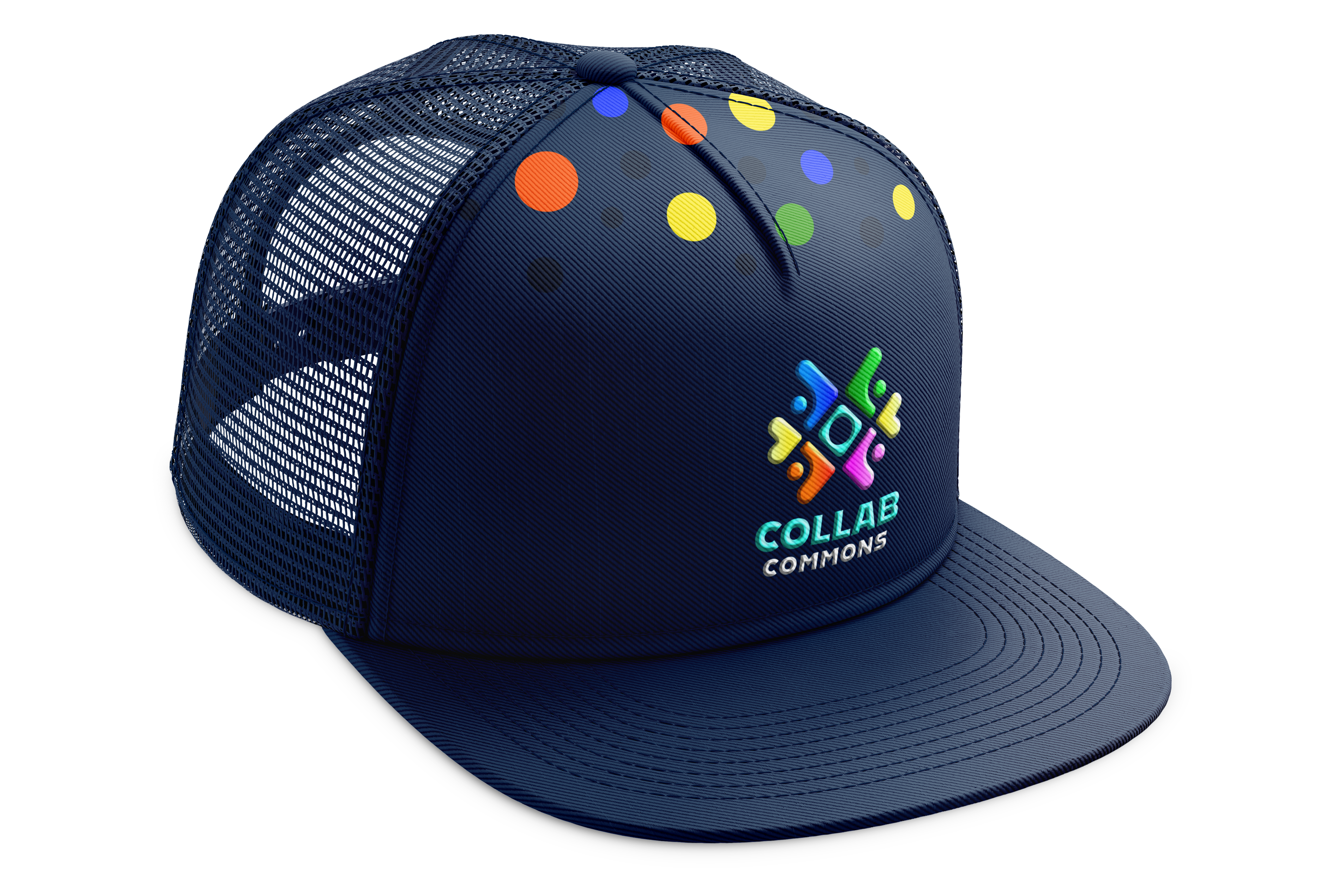
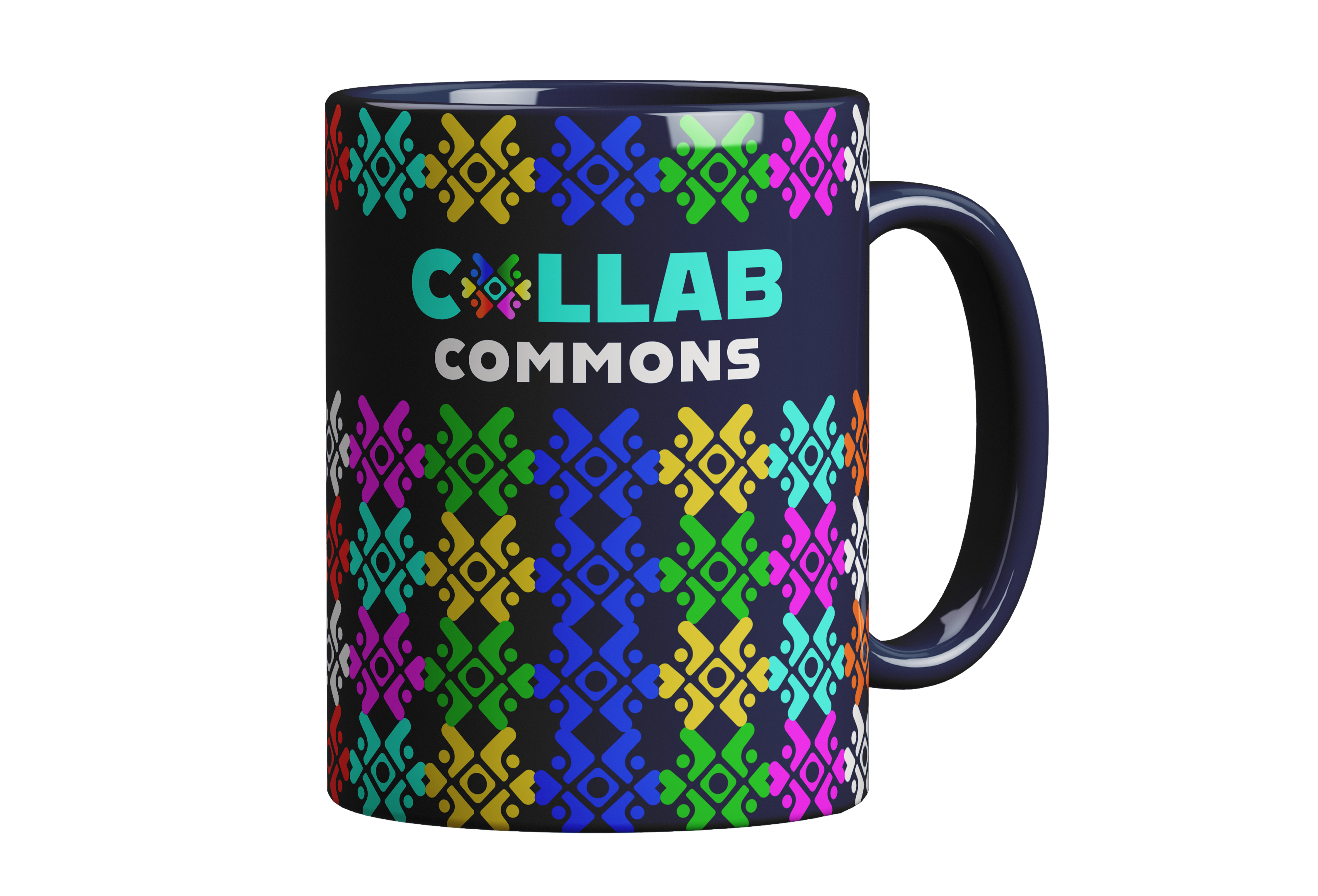
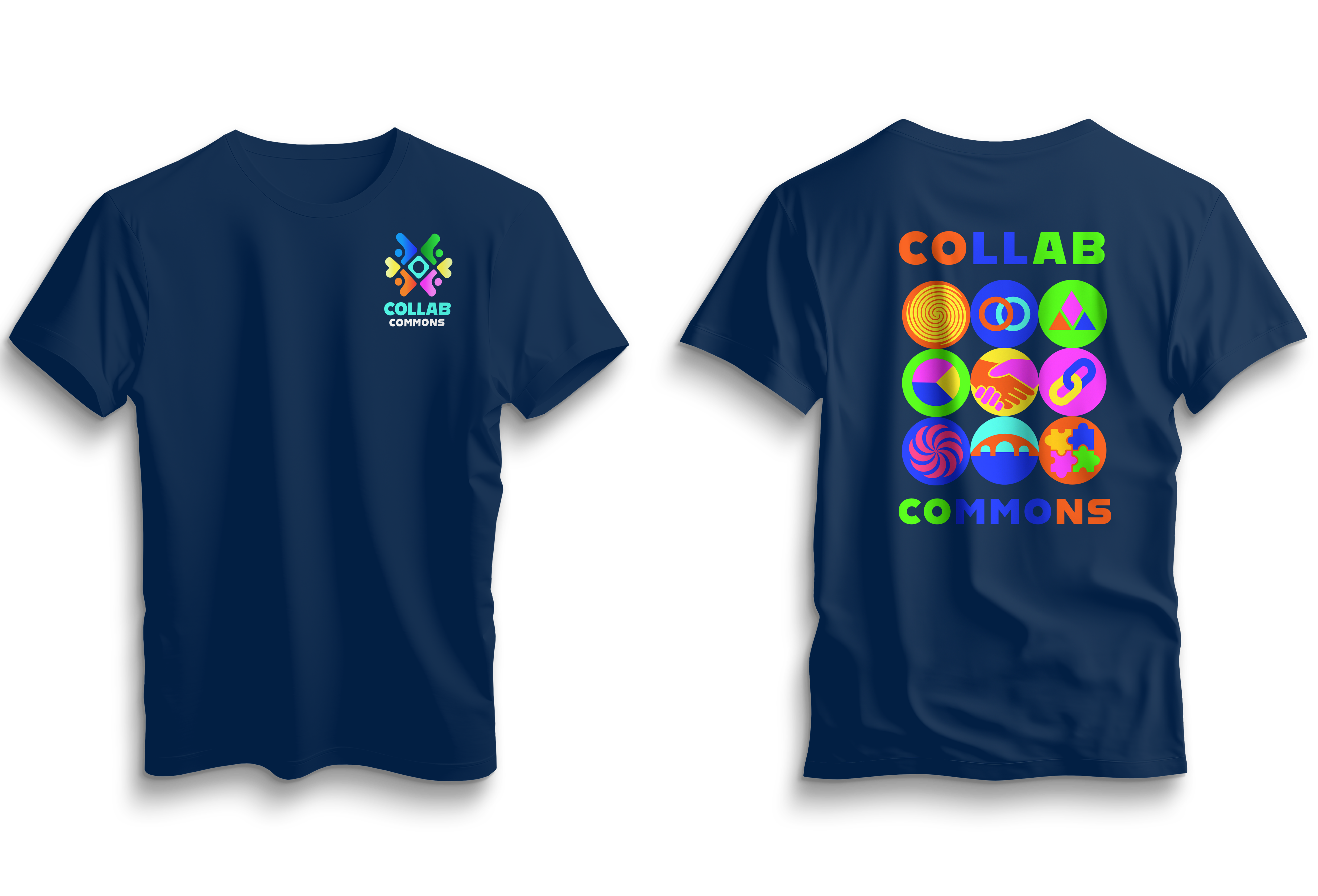
The Collab Commons brand extends into physical assets such as apparel, drinkware, and a custom mouse pad, reinforcing the identity through everyday use. Consistent color, pattern, and icon applications create a cohesive and recognizable system, while allowing flexibility across different formats. These assets help turn the brand into an interactive experience that reflects collaboration and community.